I have photographed 14 images below from the 140 (?) on display, each because I like it for different reasons and feel I can learn from studying it. The images are not very good. Many of the works had strong light directed on them, and this made photographing them difficult. Also some were big and quite high up and I have distorted them.
Interestingly, all the works in the exhibition were recognisably ‘drawings’ (appropriately for a drawing prize), apart from the winning ‘drawing’, which was a video. (I found my attention drifting when I tried to watch the video and it was probably the work I was least interested in. Although when the invigilator explained its theme, I felt more interested, but again wondered whether works should stand on their own without explanation). I don’t feel any of the works I have included below need an explanation. I have chosen some drawings for their beauty, some for mark making, some for materials, and I realise I have chosen several for their intricate detail. (I’m realising that I like making detailed work). I think the works chosen for the prize are fairly traditional. Many use traditional drawing materials. Few are mixed media. Interestingly, although I admire the skill of many of the artists, I feel that aesthetic appreciation generally is stronger than emotional experience.
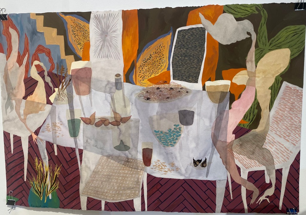
I was interested in the first work below because it uses gouache, which is something I’ve been using quite a bit recently. It also has a ‘layered’ quality, that is something I am also very interested in. I wish I had studied it more carefully because now I am not sure how the layering is produced – is it actually a thin layer, of say wash paper on top of the work? Or is it painted to give the appearance of layering? Anyway I like the strong blocks of colour and pattern, as well as the marks and lines on the chair, on the floor, in the object on the mid right that might be a TV, and the objects that look rather like seed heads. It could almost be a collaged textile. It is perhaps the work that is most on the edge between drawing and painting in the exhibition. I guess some of the line and mark making push it into ‘drawing’. I like the colours and I like the rather wavy composition – almost like a table on a ship in a storm.
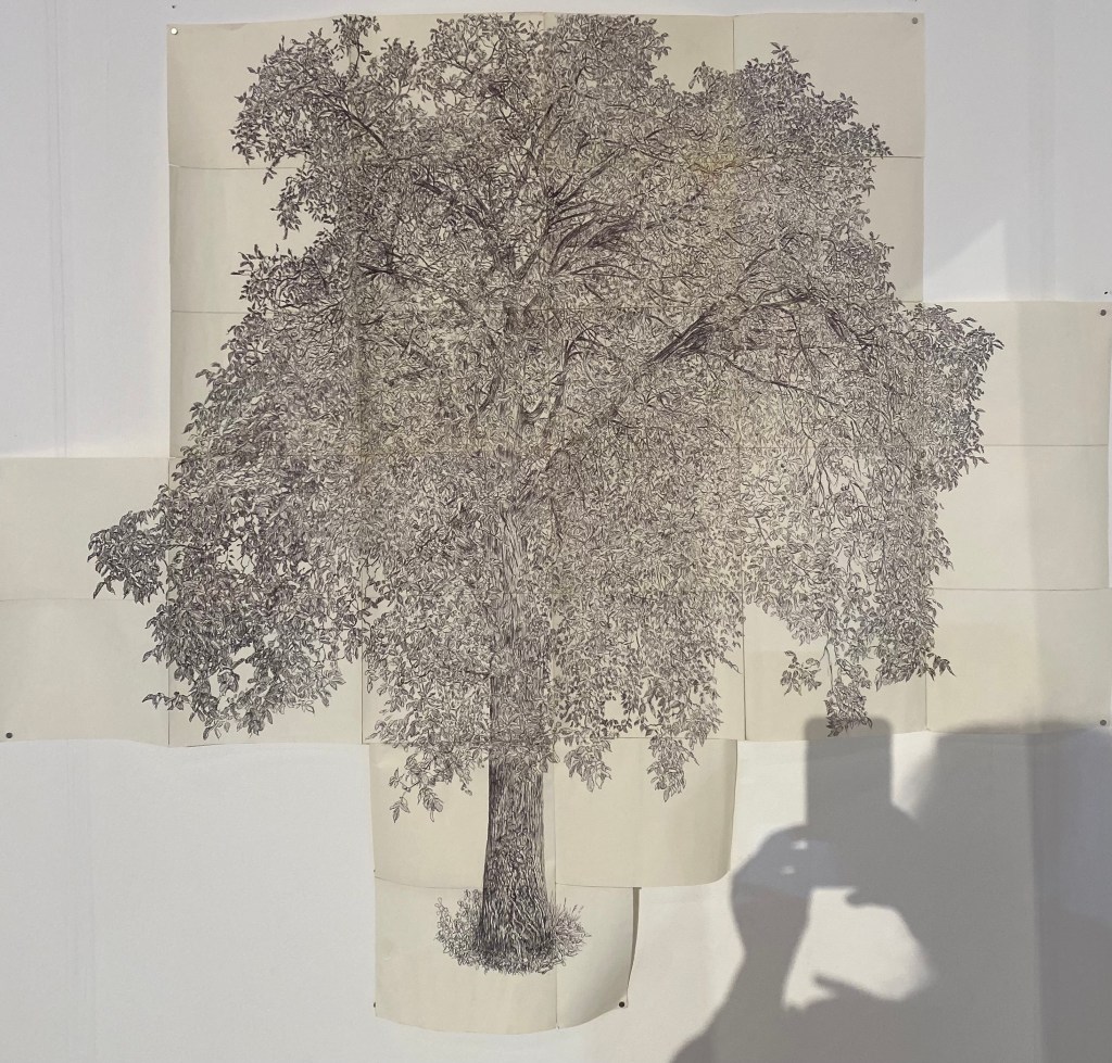
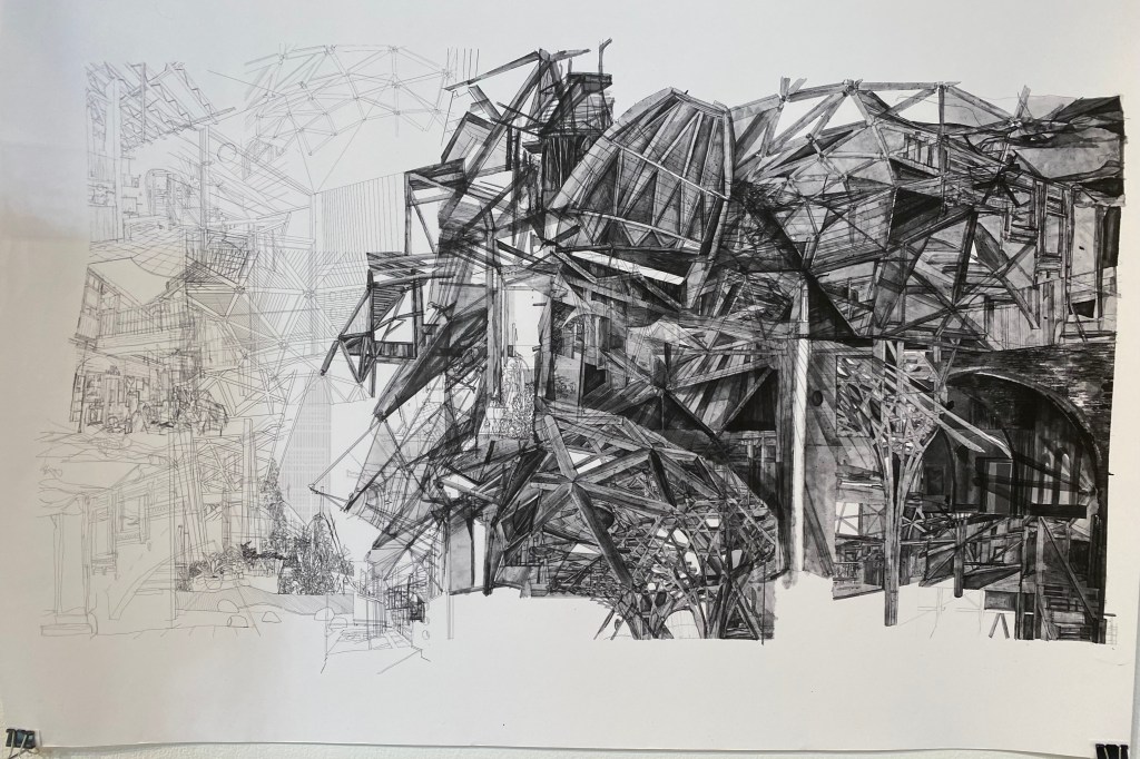
I am currently working in biro and I see I have photographed a few works that use biro. I like the detail that can be achieved. Here I was also interested in how many sheets of paper have been used to make the whole. I count 28 sheets. The tree is very large. It also reminds me of William Kentridge’s Trees that also use many sheets of paper. Perhaps if I were to make a large drawing I would use the same idea. This makes it possible to make a huge drawing in a small space and to move it around easily.
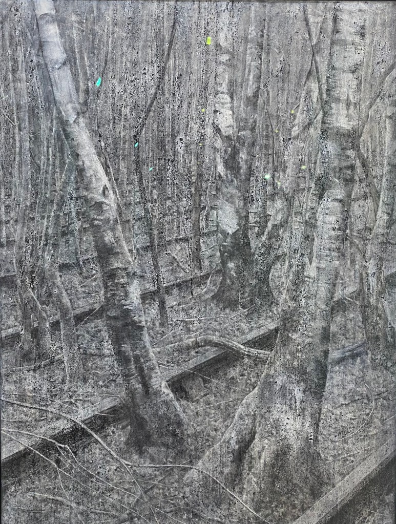
Two things struck me about the work by Alan Stones below. One is the small dots of colour – I’m thinking of similarly adding small amounts of colour to charcoal drawings. The other thing is the texture he has achieved by using charcoal on prepared linen. It’s very tactile and beautiful. Again this is a very large drawing.
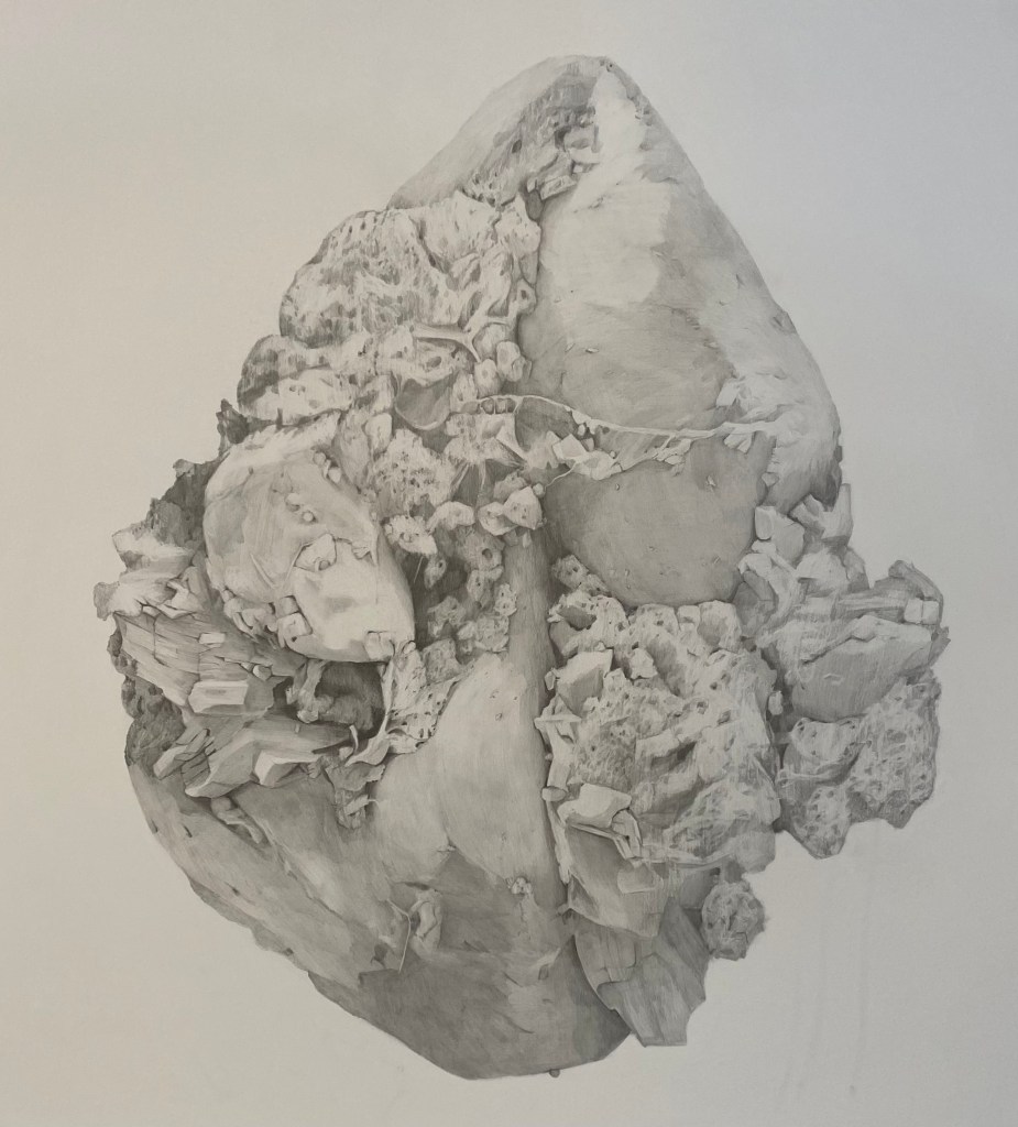
Below, chosen for the detail and delicacy of the drawing. Interesting to see a work where the scale has been changed so drastically from a microscopic particle to something that was very large. I’d like to think more about changing scale. We definitely have a totally different perception of dust because of this enlargement. We see it as something organic, and even though delicate, still pretty solid.
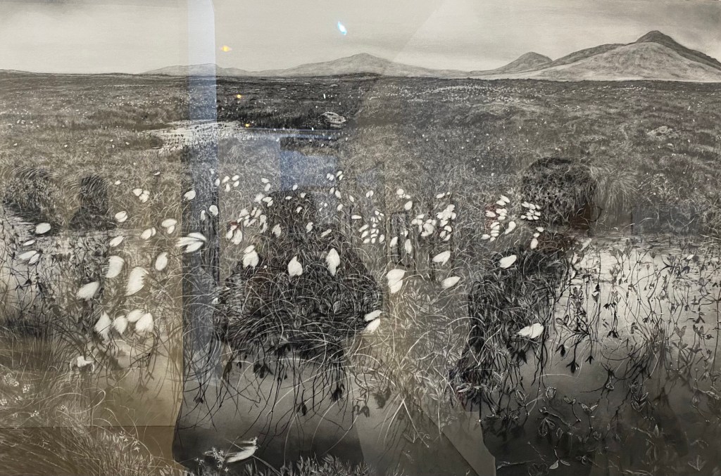
Unfortunately I botched photographing this work. I liked it for the detail, pattern and mark making. It’s very beautiful. I also like the title. Titles are important to me, and it’s interesting that the artist is not only describing the beauty of the place but making a point about how wilderness is disappearing because of human activity.
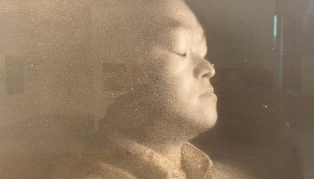
Another very technically beautiful work. Also one of very few portraits. The smooth texture and tonal contrast is stunning.
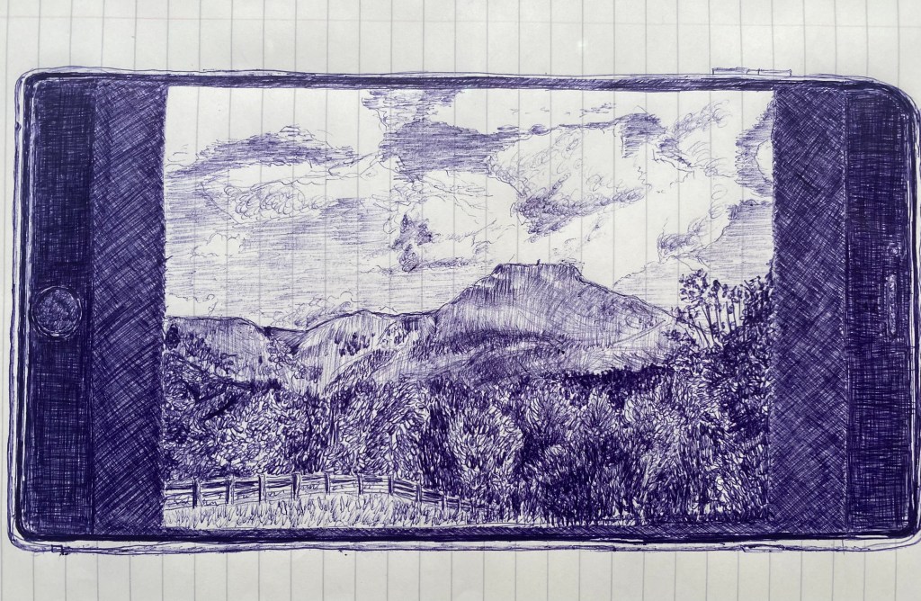
Below, another work chosen because it is in biro, but also because it incorporates the phone itself, and also because it’s drawn on lined notepaper. The whole impression is one of speed and quick impressions, which is of course what we capture on the phone. I also like the movement in the sky and the different pattern. Two similar drawings were included in the exhibition from the same artist. I really like them.
And I realise I have included yet another biro drawing below. I don’t like the title of this. It’s almost as if he is denigrating his own work. there is nothing silly about it. Lovely pattern and great detail. I particularly like how he has used larger and larger pattern as he gets to the front of the scene, giving a good sense of perspective. It’s rather like a wood block print.

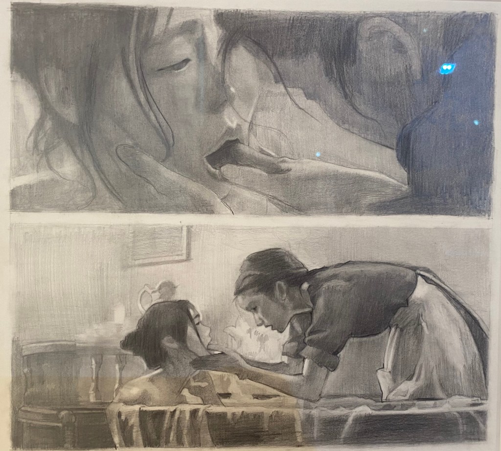
Yet another delicate and beautiful work. I like diptychs and triptychs. I thought that this work must also be on linen, but it is in fact fineliner on paper. I love the fabric like quality. The lines for the hair and lashes are beautifully fine. It’s absolutely beautiful. The perspective is also interesting: a very close view of one eye and a girl without a head.
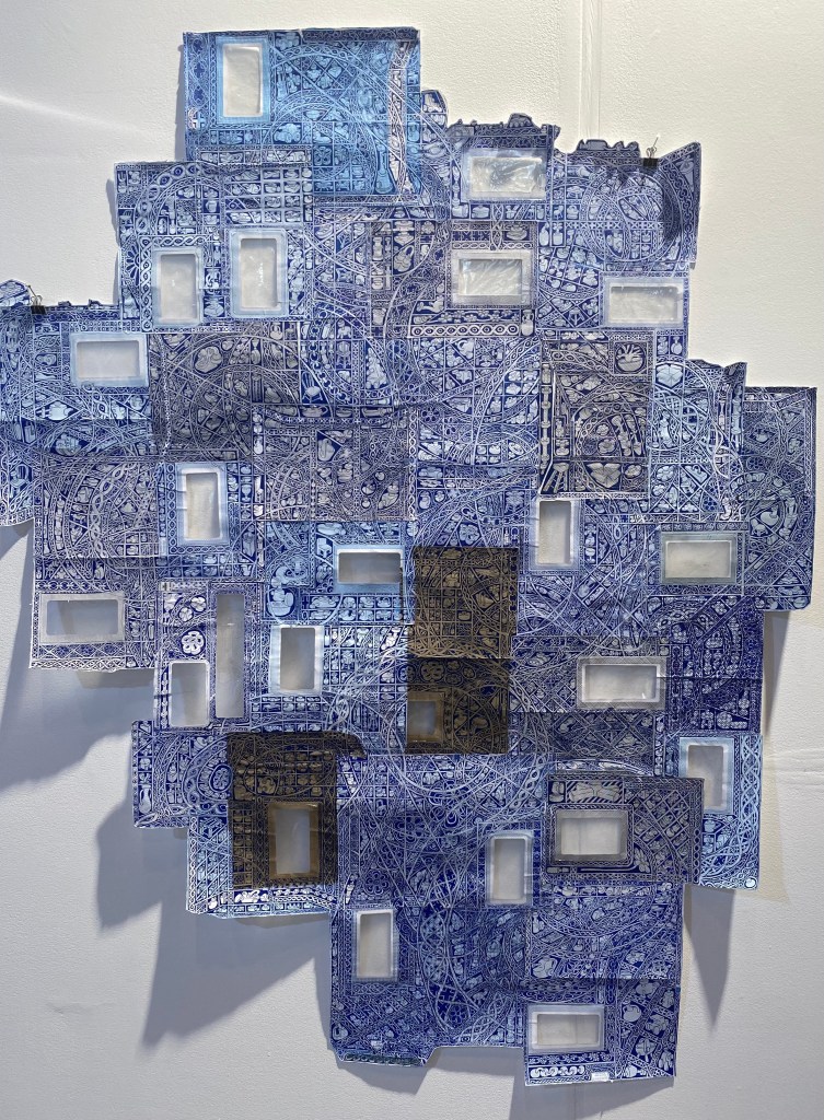
Below, ink on used envelopes. Perhaps biro again? Lovely colour and pattern. Beautiful fine detail. The windows in the envelopes make us think of a building. The pattern is also very like tiles. It’s interesting how the pattern links one envelope to the next, and is continued on it. This work, and the penultimate one on concrete, make me wonder what I could draw on, or whether there is some material I could attach my drawing to that would communicate something more about my subject. .
I just really like the detail again here. I also like the tonal contrasts and the fact that part of the drawing on the left is unfinished. I guess digitally hand drawn means it was drawn using computer software.
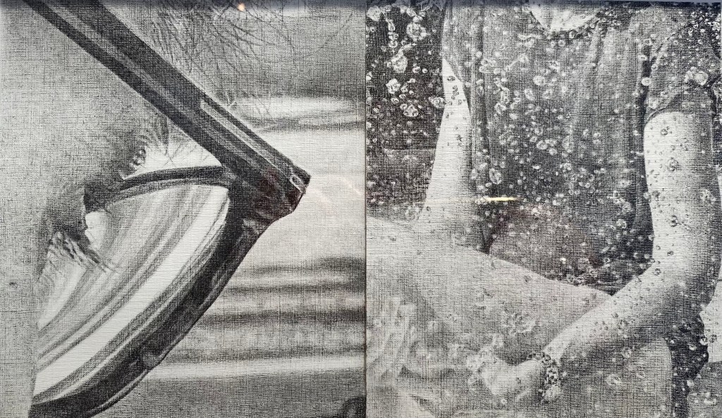
The diptych below interested me because of the two different perspectives of the same scene. It’s also interesting because unclear what is happening. I first thought the woman was the mother of a child. But on second thoughts I am not so sure she is a child, and she looks very unhappy. And why is the woman doing the examine called ‘The Handmaiden’. This reminds us of ‘The handmaid’s tale’, and begins to take on darker meaning, which is always interesting.
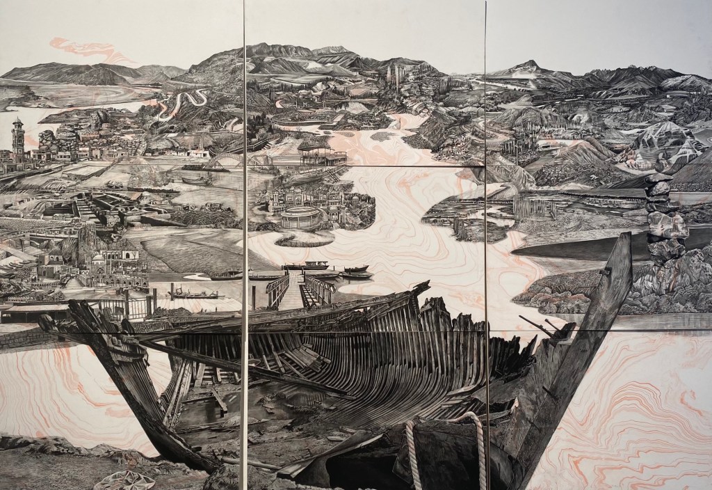
I needed to look up ‘suminagashi’ and found it is an ancient Japanese marbling technique. It works very well beneath the graphite drawing. Again I see this is made from 9 paper panels – and again it is a large work. It’s technically brilliant. I wonder how the conception for such detail arises? Is each panel inspired by particular images seen or drawn earlier? Presumably this refers to the Indus Valley and an earlier civilisation. It is very interesting and very clever.
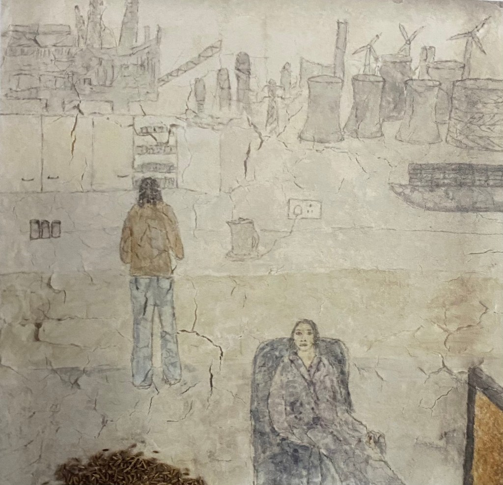
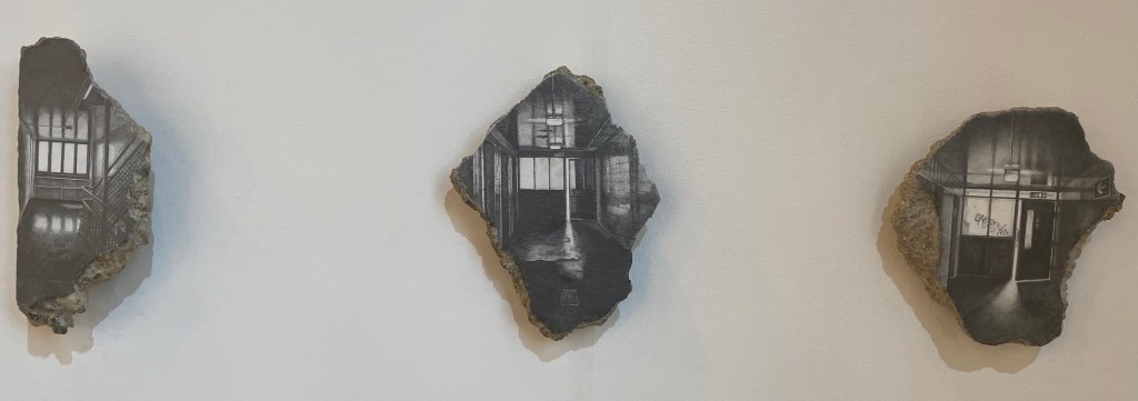
I like these drawings in graphite on paper that is then glued to salvaged concrete. I like that the drawing is made to fit the shape of the concrete (almost), and that the drawings are of industrial buildings, presumably the concrete was used to build such buildings at one time. The drawings are quite small and delicate. The titles seem to refer to the places as somewhere that two people (lovers?) met, perhaps illicitly. Quite intriguing.
I included the drawing below mainly because it is drawn on filo pastry. I tried for a while to make flour and water dough, with added salt, to draw on. Mainly because I was making drawings to leave in a cave and I wanted them to be fully biodegradable. The drawing itself seems to refer to industry, perhaps the journey of the spice and sugar to reach our kitchen. I like that cumin seeds and sugar are used in the drawing as materials to reference this trade, and the fact that the sugar and spice trade were central to colonisation. I like that the artist takes ingredients we all have in our kitchen to explore wider political issues. It reminds me of the saying ‘the personal is political’.