- Commemorating some of the many killed by the Animal Agriculture Industry (This might expand to people imprisoned for their Activism for Other Animals)
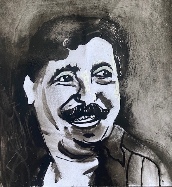
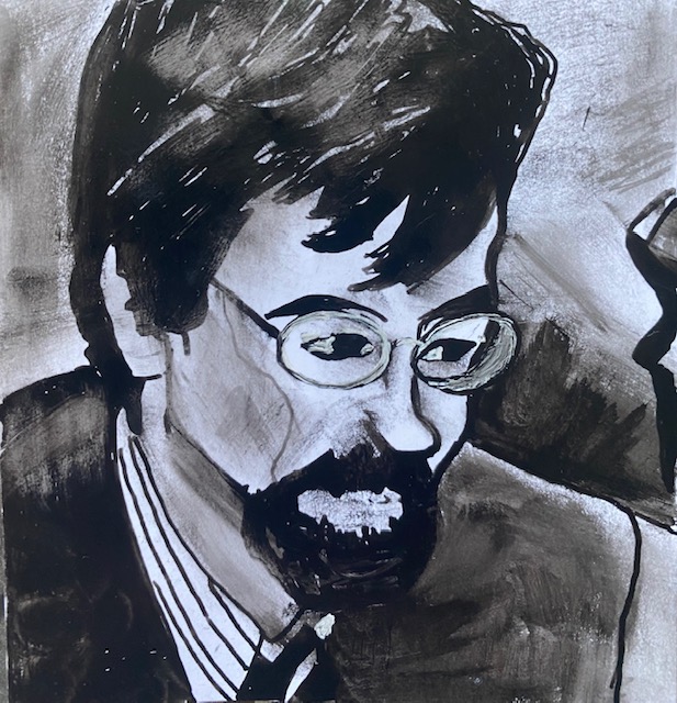
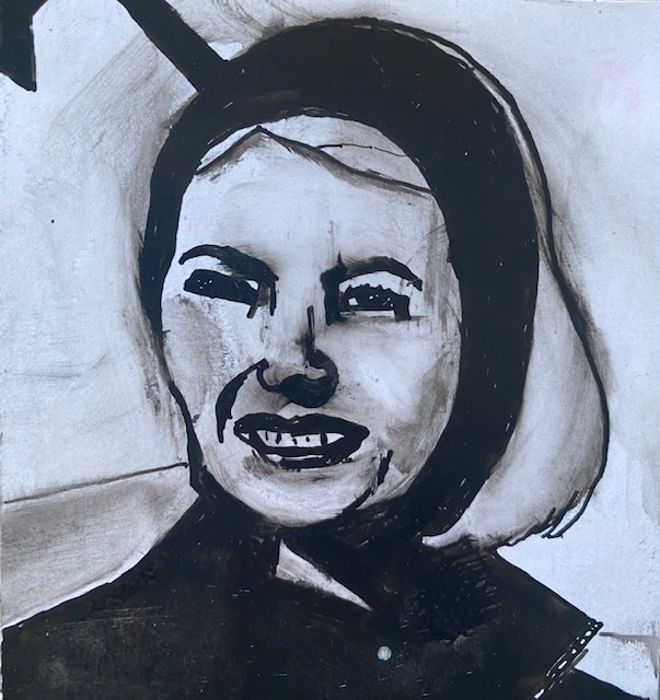
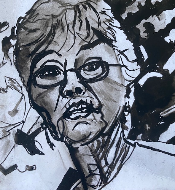
I decided to start this focus by making portraits of activists for the rights of other animals. This decision came from thinking about a sense of hopelessness that we can so easily feel when faced with the capitalocene. I read a book by Tekiner (1999) on the Romantics, who argued that the early German Romantics were disenchanted with society, but offered hope through Nature. I feel that activists also give us hope through their courage and convictions – I think they would not act if they did not have hope themselves that they can change things. I decided to focus initially on activists who have been killed by the animal agricultural industry. I am also influenced here by my reading (Wolfe, 2008) that suggest that the most important thing all life has in common is that we are all mortal, and therefore, all vulnerable.
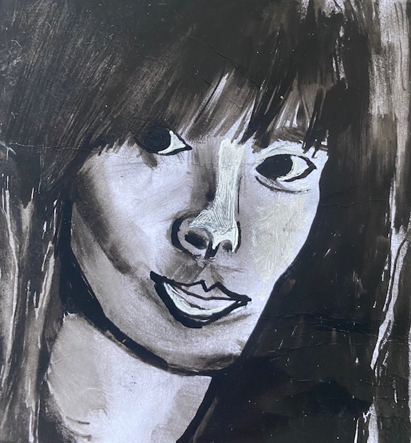
I plan on making black and white portraits, with touches of gold. I plan for the ‘resolved’ work to be a little bigger than I normally work (about 20 in square), mainly in charcoal (this is a challenge for me since I prefer to work small and I do not use charcoal very often, and nor are portraits a usual subject. I like black and white drawings, and remember reading in an exhibition on the monochrome at the National Gallery a few years ago (https://www.nationalgallery.org.uk/exhibitions/past/monochrome-painting-in-black-and-white) that the absence of colour focuses us on what is most important. Black and white is dramatic. I decided to add touches of gold to these portraits as a symbolic reminder of their love and courage, and of how precious they are (perhaps I may consider adding a touch of royal blue and terracotta).
Gold
I read the following about the symbolism of gold.
Gold is illuminating, sacred, durable; it is precious. It is almost universally associated with the SUN, or the highest stage in spiritual development. The first is black – sin and penitence; then white – remission and innocence; then red – sublimation and passion. It is heralded as embodying the powers of the EARTH, and it is light. It is the heart of the earth, so it is symbolic of superiority. The Tree of Life supposedly had gold roots, plus (gold symbolises)wealth and abundance. Its immunity from rust brings it connotations of immortality and incorruptibility. It is an amulet for wounded people. Along with being the heart of the earth, gold represents heart, love and blood. In Melville’s Moby Dick, sun, blood and gold are together. Combinations: a golden apple is immortality, ball is wisdom, sun, chain is honor, dignity, respect and wealth.
http://websites.umich.edu/~umfandsf/symbolismproject/symbolism.html/G/gold.html
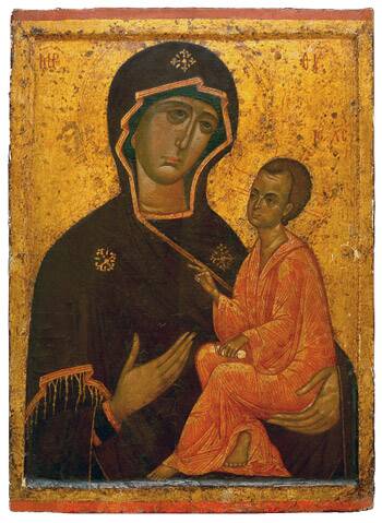
Gold’s connection to the Sun – the giver of life, and its connection to the heart – makes it particularly appropriate for this project. The people I am celebrating here were most concerned with Life – they had a heart, in the sense of courage and commitment. I’m reminded too that gold was used in Religious icons. For example, below, presumably for the same reasons that I intend using it.
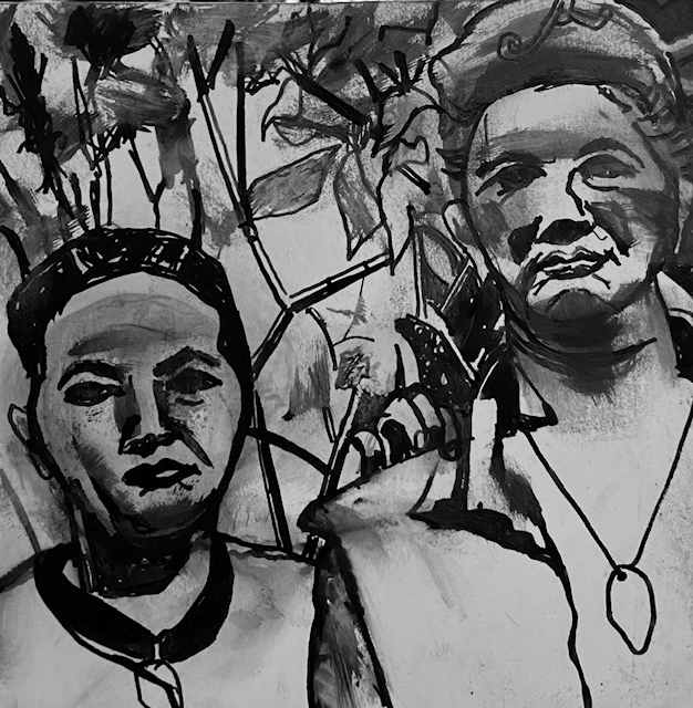
I first looked at other portraits that I like. For example, these by Marlene Dumas, whose work I like a lot for its expressiveness, and also for her use of colour. Dumas has painted people who have been involved in Protests – for example the wife of the murdered president of democratic republic of Congo – Pauline Lumumba. She has also painted people who are no longer alive – for example, Amy Winehouse. All the portraits below are oil paint on canvas.
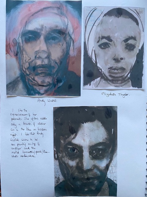
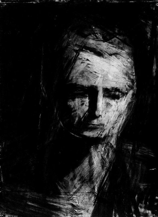
I also like the portrait below by Frank Auerbach. This is in charcoal. He has achieved a very rich black that I’d like to achieve. I like the way he seems to have ‘carved’ the head out of the paper. I know that his process stems from his interest in the impossibility of really ‘seeing’, nd involves long hours sitting with the same model: scraping back, building up his portraits over and over. Dumas on the other hand more usually draws with photographs – as she has above. Auberbach’s portrait is a reminder to myself to think about scraping/scratching back and building up the work. Also a reminder that with charcoal I can keep going until I feel satisfied.
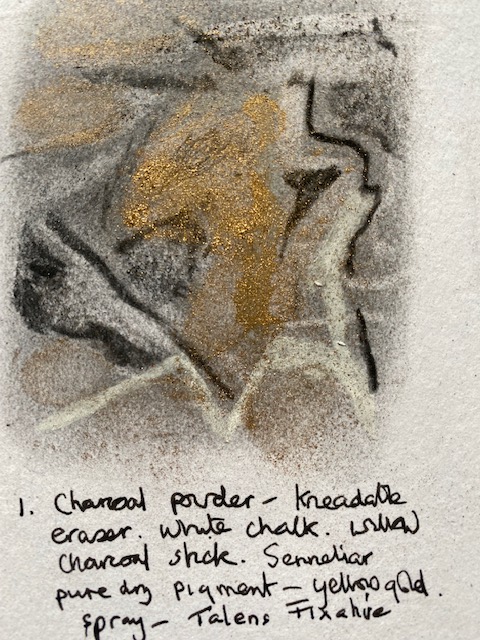
Experiment 1. 18 October 2022
I have used charcoal before but its been a long time and these experiments are to remind myself of its property, as well as to experiment with charcoal alongside different gold mediums. Below I have started with charcoal powder, which gives a light grey tone, as well as used white chalk and willow charcoal sticks to give a darker contrast. The gold here is pure gold dry pigment, which I found works perfectly well with charcoal. Strange that, to me, the scribbles have a slight look of a human portrait – which I had no intention of producing here. The gold is much brighter than captured by my camera.
Experiment 2.
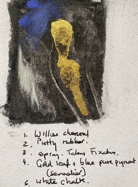
Below I started with willow charcoal to see how dark I could make the background. It is still not the deep jet black achieved by Auerbach. I used a putty rubber and white chalk before spraying it with Talens fixative – I could have gone over it again with a second coat of charcoal. I have then used gold leaf. NB. I must remember to let it dry properly before brushing off the excess – unless I want brush marks, which I might. Also important to note that I will need to decide how precise I want the gold to be. gold leaf can be very precise, while gold powder is much looser. I could use both in the same work to get different effects. The blue is again pure pigment. If I use blue I might want something lighter.
Experiment 3.
Trying to get a deeper black. Here I used compressed black charcoal. The slightly lighter grey at the top is the charcoal covered with liquid graphite.

Experiment 4
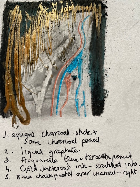
Learning so far – I prefer the soft blue pastel on top of charcoal on the drawing above to the acquerelle pencil or the blue senellier pure pigment, although I think a TINY touch of the blue pigment would be ok. The gold ink is very bright and perhaps too bright – again unless I use a very small amount – I like that it can be scratched into and I could add then remove as much or as little as I wanted. It would be interesting to try gold ink on top of gold leaf or gold powder then scratch into it. I like the scratching into liquid graphite with white acquerelle pencil – above Teracotta pencil into liquid graphite also works well. Compressed black charcoal and charcoal pencil both achieve a good solid black.
Experiment 5
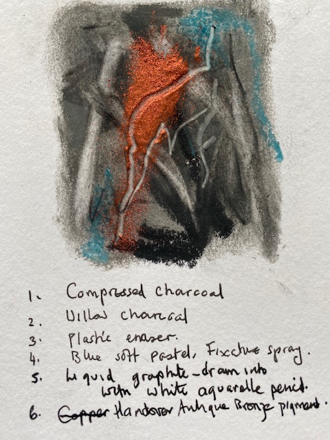
I like the colours here and the variety of tones of grey/black I can achieve by using compressed charcoal. I note that, although not deliberate, the colours are similar to those used by Marlene Dumas in her portrait of Andy Warhol. I also like the way that the sprinkling of copper pigment (that I then shook off the page) sits on either side of the line drawn with white aquarelle into liquid graphite. I actually prefer the copper to gold – it’s warmer. I searched for the symbolism of Copper:
Copper: love and spiritual connection, enhancing intuition and psychic abilities. Aid in the manifestation of desires. Protection.
Perhaps I could copper in my portraits – I have already mentioned the importance of love. Spiritual connection seems essential in relationship to ‘Other Nature.’ One thing I also like about copper, as opposed to gold, is that despite all its positive attributes, gold is valued in terms of money above anything else, in Western materialist culture.
19th October 2022
Experiment 6
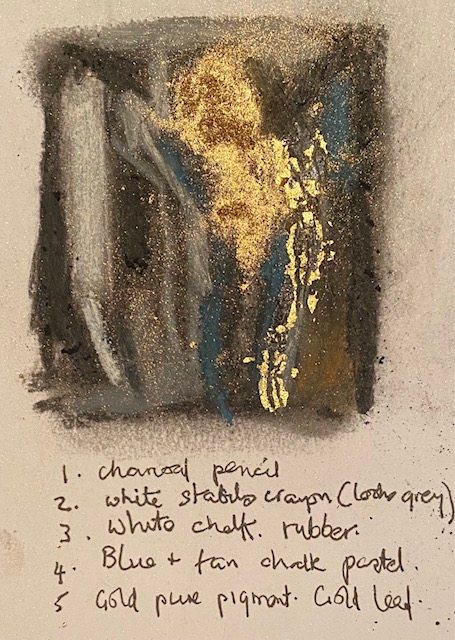
Overall, the experiment above is dull because not enough tonal contrast. What I did learn from it though is that it is possible to scratch through gold leaf before fully dry and that gold pigment is best not sprayed with fixative – this spreads it everywhere. Better to use a very thin layer of fixative – or perhaps the size used for gold leaf – and then add the gold pigment, before knocking any excess off by turning the paper upside down. Woodies pencil on this gave a grey finish. Everything is muddy – even the gold.
Overall, I like the use of gold pigment better than gold leaf or gold ink – it gives a softer finish. But it really depends on how and where I decide to use it – if for example, I were to copy iconic paintings of the Madonna and child, and use gold in the background – I might use gold leaf. I don’t like the tan pastel on the final experiment because the tonal contrast is minimal. I like the marks made by drawing into liquid graphite with Acquarelle pencils. I like the softer blue pastel better than the harder blue pigment . I will start the first portrait using compressed and willow charcoal, liquid graphite, blue pastel, blue and white aquarelle pencil, and touches of gold pigment .
I was wondering this morning about borrowing ideas from Judy Chicargo‘s ‘Dinner Party’. Chicargo, with the help of other makers, made an installation in the 1980s that paid tribute to women she identified as change- makers. One side of the triangle was dedicated to pre-history to classical Roman, and included, for example, Boadaceia. Another side was Christianity to the Reformation and included Eleanor of Acqataine. The third side was the American Revolution to the Women’s Revolution, including, for example, Sojourner Truth, Virginia Woolf and Georgia O’Keefe. Each side had 13 place settings, each with a different banner and a ceramic plate (c. 12 in and decorated with reference to the vagina/vulva) to honour the woman. I saw this installation in Islington about 1985. At the time I was an Advisory Teacher in London for Anti Sexist Education. I remember that the lighting and setting contributed to the feeling of awe and reverence in the room.
This work took five years to make and involved the labour of 400 people. I was wondering about making a plate to accompany the portraits, perhaps even an embroidered place mat. Plates and food are particularly relevant to this project on human relationships to other animals, and, in my culture, our taken- for-granted supremacy over others. Plates are relevant too because those I am paying homage to were killed by the animal agriculture industry. The plates could, for example, include messages from other animal rights activists, or images of those the activists were protesting for.
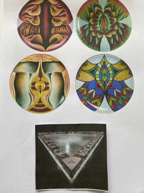
Judy Chicargo’s work is generally political – she uses her work to draw attention to the inequality and objectification of women in a commodifying society. I consider my work political too – for a significant part of my life I worked in gender education, and, in this current project, I am now focusing on the oppression and objectification of other beings.
4 inch biro studies on PLIKE
These are quick studies to help me get a sense of proportions and expressions.


Ideas for further development at this point:
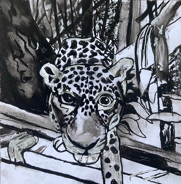
- Develop 6 further drawings showing the animals and rainforest that these activists were determined to protect.
- Could I make an animation, inspired by artists like William Kentridge and Catherine Anyango , made from portraits above, as well as drawings of calves and pigs in a truck, and the destruction to the Amazon? I’ve been thinking about how to incorporate the text and about e.g. layering it over the top of drawings, but an animation with voice over might work better. Or if I were not to make an animation, still think voice over drawings much better idea than layering – could be a recording with ear phones. Or could at a pinch be text based visual work that is separate from drawings. Or could be Zine.
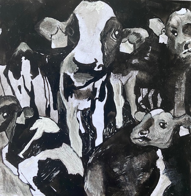
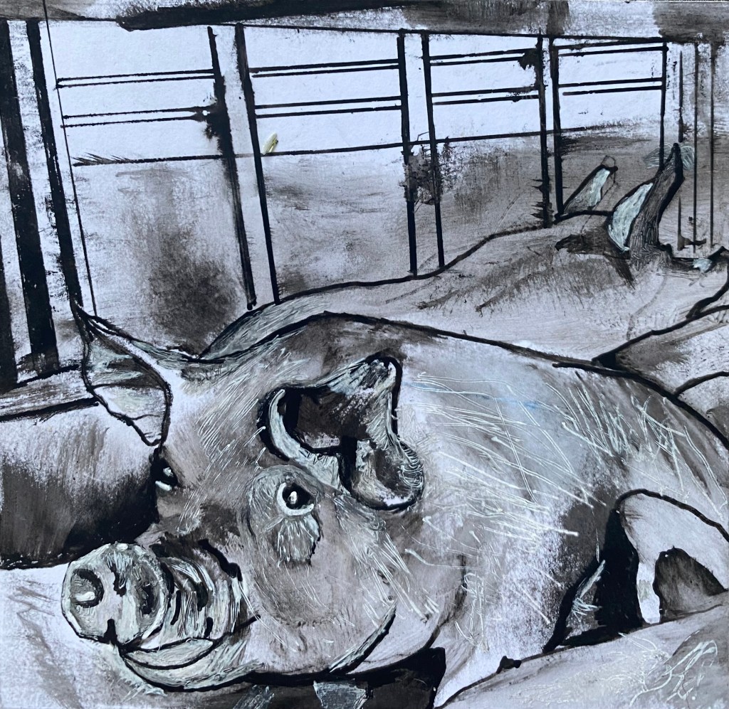
6 further 4 inch quick sketches, with biro, of those whom activists were determined to protect:


Here is a mock up of the drawings I could make. I’m wondering now, too, whether they really need to be as large as I’d first thought? Or even if they all need to be the same size?
nb.I’m thinking of using gold and green pigments alongside the pastels rather than gold and blue. also green in the chakra’s is JOY and that might be more important than communication (blue chakra) at this point. Green is also used heavily in our culture to denote plants and environmental sustainability.


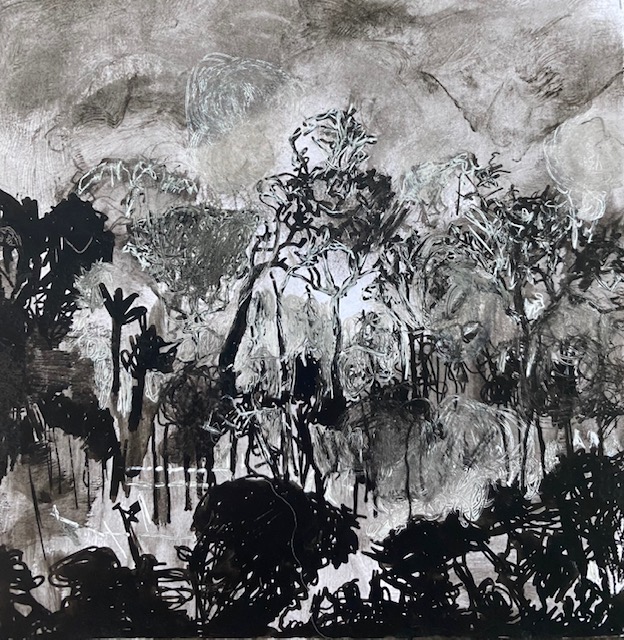

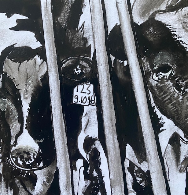
Cattle ranching accounts for 80% of current deforestation throughout the Amazon. In the Amazon basin the cattle herd has increased from 5 million to 70-80 million since the 1960s. (https://wwf.panda.org/discover/knowledge_hub/where_we_work/amazon/amazon_threats/unsustainable_cattle_ranching/)
nb. think about developing top right image as a layered work with charcoal, ink, wax, thinned acrylic paint. Incorporate text to accompany this series. e.g. Animal agriculture: brutality beyond imagining. Text could be a final layer or incorporated in a penultimate layer.
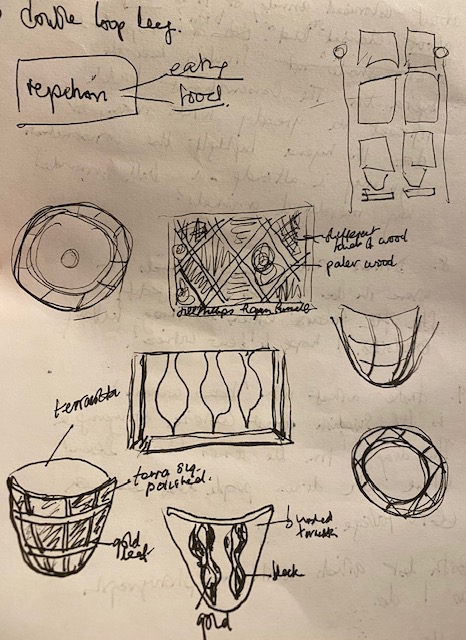
Maybe I’d show the portraits in a square format like above, but this would be big if I stick with the 2 x 2 feet I’d originally thought – 8 feet x 6 feet. Or if I make them 18 in square then 6 feet x 4.5 feet. These portraits are to ‘bear witness’ and to pay homage, so I’m thinking about making the installation as beautiful as possible. For example, I like the idea of a shelf beneath each column of portraits, made with different woods as in the sketch above. Each shelf holding a bowl made from terracotta that I would use resist on at the leather hard stage to wipe away clay between raised ridges (shaded in the bottom left bowl) to echo the pattern of the shelf. After biscuit stage I’d coat with terra sig. and polish, then refire to 850 degrees C. Then the raised lines would be covered in gold leaf. It would be nice if I could smoke- fire the ceramics it but I’m not sure if that facility exists. The bowls would be filled with myrrh and Francincence, to echo the gold, myrrh and frankincense gifts in the Bible. It would be good if I could burn the resins. This would be perfectly safe in ceramic bowls, but I’d need to do a risk assessment – the smoke might set off the fire alarms!
Reflections on learning and next steps
I’ve been giving quite a lot of thought to the question of:
‘How do your choices of materials and processes reflect or express your ideas or help to further your understanding of your subject, or suggest new directions for your research?’
I understand this to relate to materiality. My first thoughts on this are that my mediums and supports are all vegan. I do not use materials that use other animals, for example, sable brushes, gelatine size in paper, paint colours using animals excretions or extracts, and so on. I’m also interested in keeping my work to a reasonably small size to save materials, wastage, space in the world. I think this is quite important from an ecological perspective. It’s also another reason to work in a detailed way that takes more time in the making, so that I do not produce many quick works, but rather produce perhaps only a few more considered and time-taking works (as for example the detailed biro drawings of cells which took about 30 hours each). I also use recycled paper where I can find it, or PLIKE – an environmentally sustainable/friendly, plastic free alternative to paper that does not use tree pulp. Or Washi paper’s are also wood free and made from more sustainable crops.
Today I was thinking about other materials that might be used and that might be helpful in expressing my ideas. For example, plant foods themselves. I would not want to be wasteful. Perhaps the commemorative bowls/plates I make (I was thinking of myrrh and frankincense in them) would instead hold fruit. I could then give the fruit away at the end of the day. Or perhaps I can think of other vegan sustainable materials that could be used e.g. bamboo, viscose, biodegradable plastic.
OR I was thinking today perhaps the materials themselves would be a visual focus alongside the drawings. For example I could draw a portrait on PLIKE, then put a sheet of PLIKE next to the drawing – blank – with a caption beneath explaining the properties of PLIKE. l.e. I could draw attention to the materials used as well as using them.
I’m also thinking that animations might be a good way to develop the work. The method used by Kentridge involves drawing and redrawing on one sheet of paper for each scene – this seems to fulfil my criteria about cutting down on paper (I could perhaps make 5 scenes – 6 sheets of paper, and they do not need to be large), and animation is also a good way to make DIGITAL work that does not add physical stuff to the world in too great a quantity.
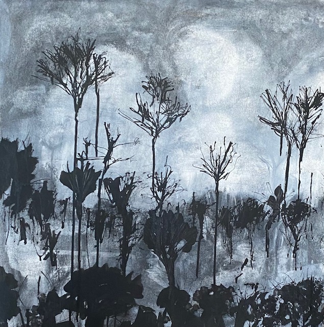
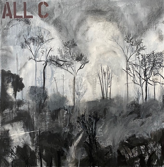
25 November: Animation
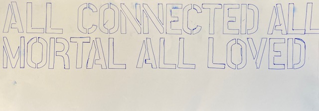
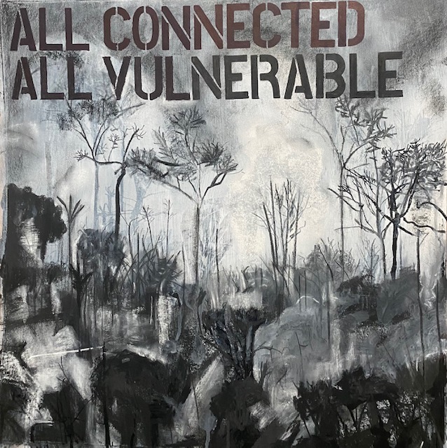
Today I made a start on the portrait of the burning Amazon rain above, in a 20 x 20 in format as an experiment for animation. I have set up my studio with a camera and light. I am thinking of using slightly different processes in this drawing, so am not sure at this point whether it is part of the final series of portraits or separate from it. I am also thinking of adding text to this one drawing. Quick experiment to see how much space on the drawing the text would use. I think this could work in the sky above the trees. I may or may not fill in the lettering with colour NB I have changed the text to a more positive and peaceful message than the one about the murdering animal agriculture industry. I’ve been thinking a lot about the impossibility/inadvisability of fighting violence with violence:
Currently I am attempting to make a stop-motion animation, and taking a shot every time I make a significant change to the drawing. I will also record this in still photographs, although not nearly as frequently. Unfortunately I did not photograph the first images with my iPhone (I did shoot them with video camera). I began by stretching the watercolour paper (Stonehenge, ‘velvet’ – vegan). I wasn’t sure why I was stretching since I was thinking it was going to be mainly dry mediums, but I’m glad I did because after the initial charcoal drawing, I rubbed down with tissue paper (drawing 1 below), and then gave it a thinned coat of white acrylic paint, which buckled the paper quite a bit, but it should dry flat again. I also worked in square format, because this is the format I am using for the other portraits.


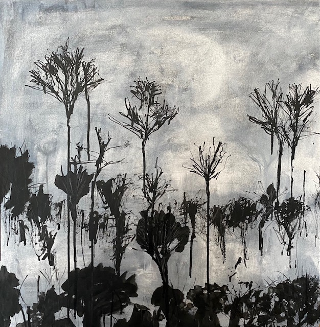
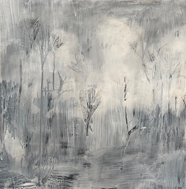

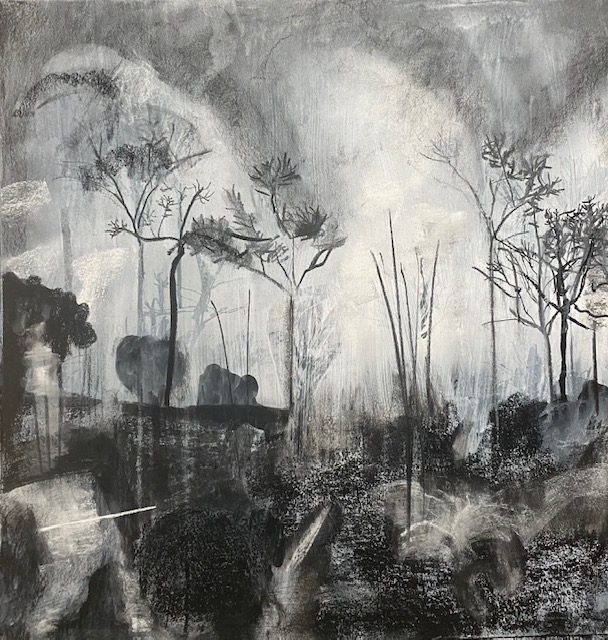
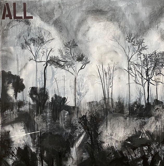
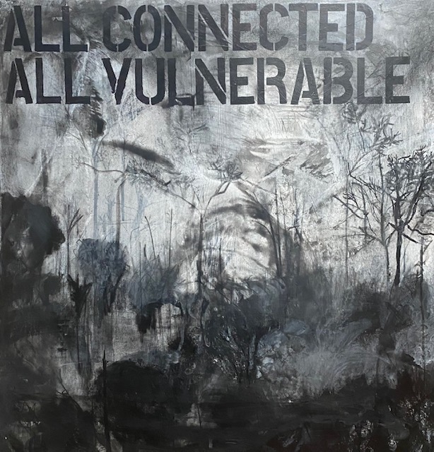
At the end of December, I have completed the drawing for the animation of the forrest, and have cropped each shot into a square format (this was time consuming but I was glad it worked perfectly well – I was worried I might only be able to use a rectangular format for video). There are, as expected, technical issues. I think the camera focus is not always quite correct and even though I drew the blinds and used lighting, and only worked in the daytime, the lighting is not totally consistent. I had 86 frames and worried this would not be enough for a short animation but I think it is enough. The video is 30 seconds long so I have used 3 frames per second and animation really should be a minimum of 12. I was worried the video might not make sense, but I think it does.
Finished Animation
Given that animation is about movement through time, I was wondering what the ‘story‘ of this animation is ( I should really know this before I start!) – apart from the story of how I made the drawing, but of course the ‘story’ is of the Amazon rain forrest and the hope that it will regenerate as soon as possible. In the drawing I am constructing the forrest, then rubbing it out, then reconstructing it, and rubbing it out again. Each time I leave a history of the previous forrest drawing. But the forrest keeps reappearing – slightly differently each time. This is true for the history of our Earth. It has been made and remade over eons, several times. The Amazon rain forrest has not always have been there – the saddest part of this destruction is the it is humans who are doing it this time. It is a terrible tragedy for the indigenous people and the animals of the forrest to be losing their home, and in the case of the hundreds of people and animals murdered by the animal agriculture industry, losing their lives. And it is important to hope.
(In fact I checked out how long it is thought the Amazon rain forrest has been in existence and read hat new research suggests the Amazon Rainforest has not existed for as long as previously thought:
The dominant ecosystem was more like a savannah than the rainforest we see today,” John Carson, lead author at the University of Reading in England, said of the findings about the southern Amazon.
The scientists said that a shift toward wetter conditions, perhaps caused by natural shifts in the Earth’s orbit around the sun, led to growth of more trees starting about 2,000 years ago.
https://www.scientificamerican.com/article/amazon-rainforest-is-much-younger-than-commonly-believed/
I have written previously that I not want to apply violence to the people and other animals, but here it does not feel inappropriate. Is that because I do not value the life of a tree as much as the life of an animal?
Final Reflections at the end of Unit 1
- As I had hoped, the work on unit 1 has helped move me on. At the start I was not so clear about my research focus and I have narrowed it from a focus on critical colonising discourses of other nature, more widely, to critical colonising discourses of other animals, and even more specifically, to critique of animal agriculture and protesting the animal agriculture industry.
- I did not want to focus on only negative terms and ideas, e.g. dissociation, violence, dissonance, but instead focus on more positive hopeful ideas, including Trust andLove. I feel first, that the negative associations are more likely to create distance between my work and other people (and there is already enough distance/dissonance between many people and cruelty to other animals), and second, in line with the Romantics, that hope is very important, and that we cannot fight violence with violence. While I think the cell work moves in that direction, I don’t think that the portrait and animation does. Need to think about this.
- AT THE START OF THE FORREST DRAWING I DID NOT KNOW WHAT THE STORY IN THE ANIMATION WAS. THE UNDERSTANDING that it is about the evolution of the forrest is important for me. However, I don’t consider this to be new understanding in ‘research’ terms – it is new learning for me (both that the amazon is not as old, as I’d thought, but also (perhaps not new but reinforced) learning that drawing is for thinking and understanding). But this thinking/understanding is personal. Can my drawing be a research technique for others ‘new’ learning, and can it be a technique for discovering something new that is not already known by other researchers (geographers, political scientists, environmentalists?…. currently MY DRAWING DOES NOT PRODUCE NEW KNOWLEDGE/UNDERSTANDING IN THIS SENSE (see Simoniti, 2021)
- This is my first venture into animation and there is much to learn about technical issues e.g. Make absolutely sure the whole of the picture frame is in the camera (the lettering is moving out of the frame). I usually work on a flat service and I don’t like vertical because I’m using black ink and very thin white acrylic which runs everywhere, but I can’t do anything about this if I am doing stop motion animation. The finished Animation is jumpy – I am not clear why. I used a camera on tripod and was careful not to touch it when the photographs were taken remotely. I also carefully measured each photograph and made sure each individual photograph was exactly the same size.
- Also much to learn about ‘story’ and ‘scenes’. It seems that Animation could be a good medium for my subject. I will have to explore this more and could perhaps build on this first animated drawing to build a story about how animal agriculture is killing the land, other animals and people i.e so far I have ONE scene built on one drawing. I could envision FIVE or six additional drawings that could be integrated into the images so far: 1. men chopping down the forrest 2. other animals fleeing 3. cattle grazing in the denuded forrest 4. Possibly humans protecting the forrest being murdered. 5. The cattle being murdered. 6. possibly a family sitting down to an animal. The animation is approximately 30 seconds so far – this might make it 3 minutes which I think is quite long enough.
- I really like that making an animation is consistent with sustainability. In this animation only one 20 in square piece of non-gelatine sized paper was used, with ink and charcoal. This cuts right back on the amount of material being pushed into the world, and because it is digitised, it means that it does not take up space and can be shown anywhere (including outside a gallery).
- I have generated ideas for further work – from the initial idea of portraits of those killed by the animal agriculture industry, to ideas for portraits of other animals (possibly including other animals becoming extinct as the forrest is destroyed) and the forrest itself, using text (although this was always a goal), using layering and beginning to experiment with animation. I wonder, too, if I have also shifted from seeing the portraits as about activism, to seeing them as about the most important thing all life has in common – mortality and vulnerability (Wolfe, 2008).
- I have given quite a bit of though to how I would like to show my work, and other surrounding artefacts, including shelves, commemorative bowls and lighting. I am still thinking about my work being discursive, and will think more in Unit two about ways I might show it other than in a gallery. Animation might open up more possibilities in this regard.
- This work was experimental and I hoped it would generate further ideas. The portraits are ‘sketches’ and small ( 4 x 4 in). One idea is to continue my initial plan to work on larger versions of the portraits in unit two. I think it is important to focus on aesthetics. The human and non human portraits need to be equally beautiful, and I need to keep to my idea of using gold powder/gold leaf. I could also extend the portraits to include other species becoming extinct because of the destruction of forests for animal agriculture. I see the portraits as a large panel, with lights at each side, shelves (that I will make) beneath, holding ceramic, commemorative gold-leafed bowls, possibly filled with fruit. This work could take most of unit two, possibly continuing work on animation, or maybe puppetry (see below).
- A focus on activism/protesting the animal agriculture industry, and our beliefs about other animals, also may be productive. I am considering interviewing protestors at animal rights events, and recording their protests through drawing and text. Perhaps this could also be an animation.
References.
Simoniti, V. (2021) Art As Political discourse. British Journal of Aesthetics. Vol 61. Issue 4, October. pp 559-574.
Tekiner, D. (1999) Modern Art and The Romantic vision. University Press of America.
Wolfe, C. (2008). “Posthumanities”. Available online at http://www.carywolfe.com/post_about.html (accessed 24 November 2022)
http://websites.umich.edu/~umfandsf/symbolismproject/symbolism.html/G/gold.html
https://www.nationalgallery.org.uk/exhibitions/past/monochrome-painting-in-black-and-white
https://www.scientificamerican.com/article/amazon-rainforest-is-much-younger-than-commonly-believed/
