Post-humanism (Haraway, date) is critical of human supremacy over the living world; the notion of human supremacy is identified with Humanism, starting with the Enlightenment. However, domination of other animals by humans goes back far further than the Enlightenment. 2 million years ago it might be that humans needed to kill and use other animals to survive, like, say, a lion. Today however they do not need to, and they certainly have never needed to find cruelty use of other animals entertaining (E.G. greyhound or horse racing).
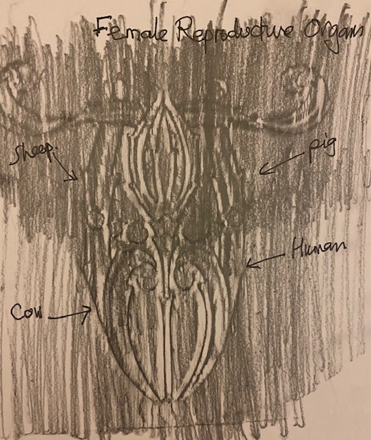
I decided to start with the idea of challenging the discourse of human supremacy and difference by looking for similarities between human and non-human animals; starting at the system or cellular level. For example here is a rubbing I took of a victorian wall tile, which I was thinking looked very like a reproductive system that could belong to any animal, but of course is not – it is purely decorative (I imagine):
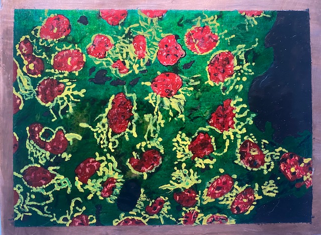
I first explore the similarities between human and pig epitheal kidney cells. My rationale is that the common discourse on pigs is that they are dirty and unpleasant – “You pig” aimed at a human means they are unpleasant, usually greedy or unkind. By spending time and being committed to these drawings I hope to honour the beauty of both pigs and people. I will make the first drawings with biro on PLIKE paper (because PLIKE is environmentally sustainable, cruelty free, strong and very smooth and white). But that at a later stage I’d like to have a go on Copper, with enamel paint and biro.
Beginning drawing:
I won’t reveal which drawing is from the pig and which from the human. I’m expecting to spend about 30 hours on each preliminary drawing. I like working slowly on this – I can do it between lectures or on a train, it’s a kind of meditation and allows me to think about my work, and possible directions for it. I’m hoping that a broad exploration during unit one will serve as a good foundation for progressive narrowing.
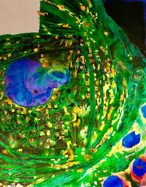
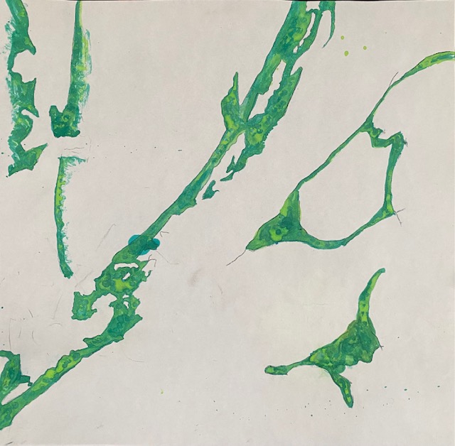
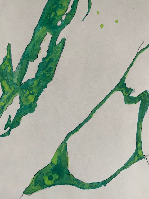
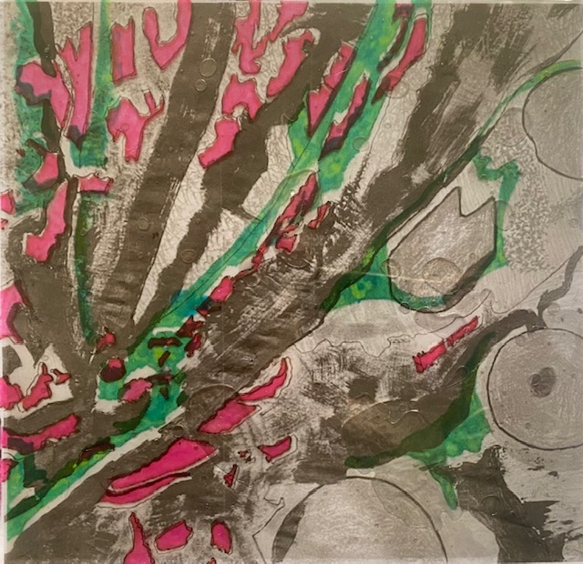
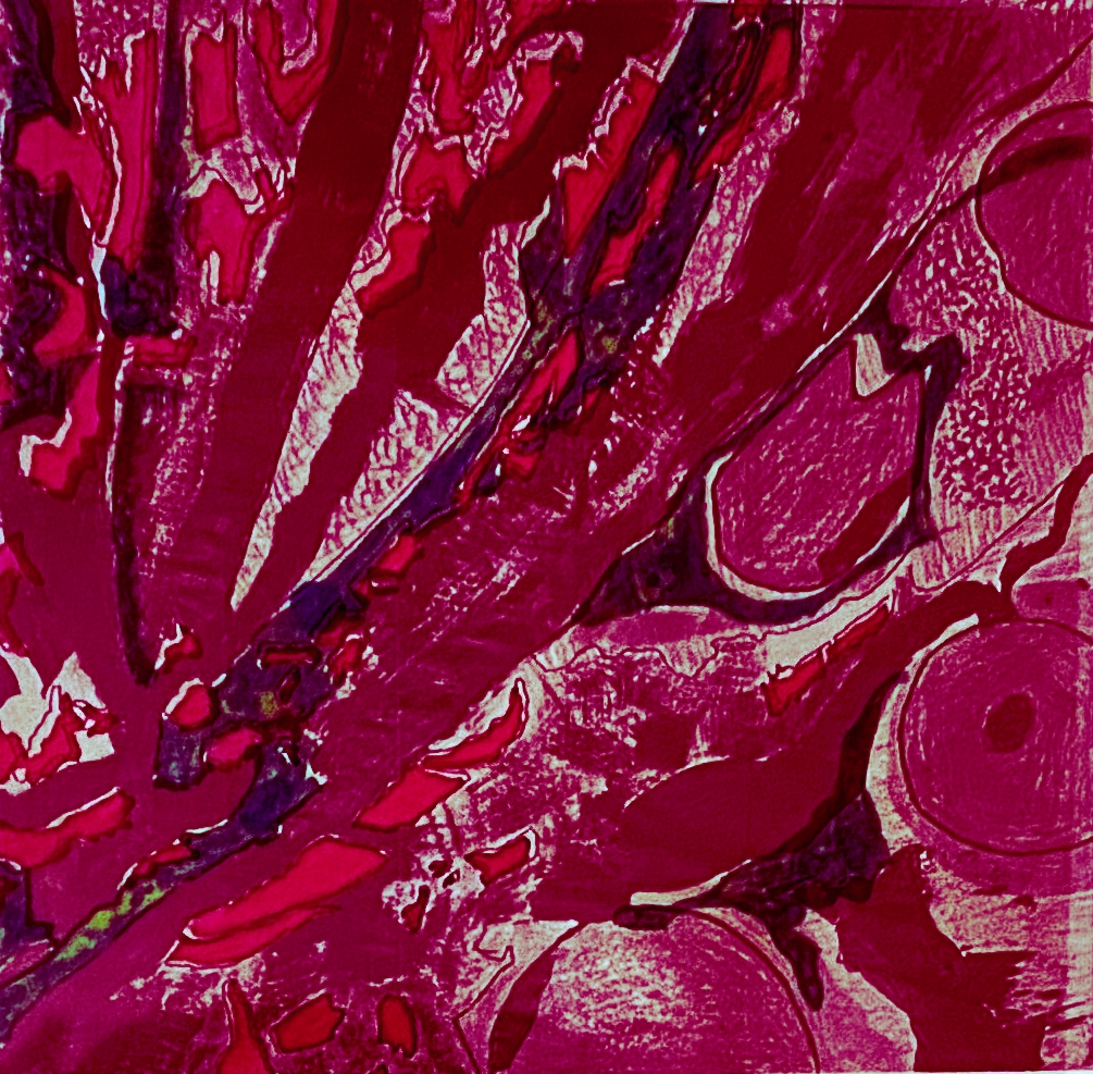
Above, I have cropped, enlarged, changed the colours of the first drawing above, and sharpened a section of it it. It begins to look quite plant-like. Also rather like embroidery, which would be an interesting way to render it. I’m wondering too about transferring this design onto the plate in commemoration of Regan Russell, who died bearing witness for pigs outside a slaughterhouse (but also have a concern that cells can remind us of flesh, and on a plate, may signify eating flesh, which I certainly would not want) . Embroidery would also be a good material to work on in relation to feminism – feminism/human rights are closely related and I’d agree that our violence to other animals underpins our violence toward humans (see writing on ecofeminism, e.g. Carol J. Adams. ‘The Sexual Politics of Meat.’ (I wonder if there is something more to think about re. the above drawings relating to their being the flesh of animals).
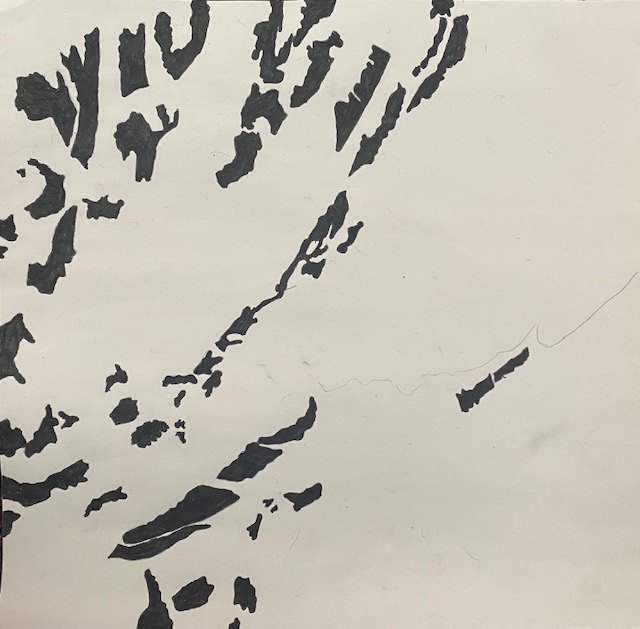
Today, 28th October, I prepared a black and white version of the crop, above, to use as part of my learning about how to make a risograph. I like the idea of risographs – they seem to work very like a linocut, but perhaps the marks and pattern can be more varied.
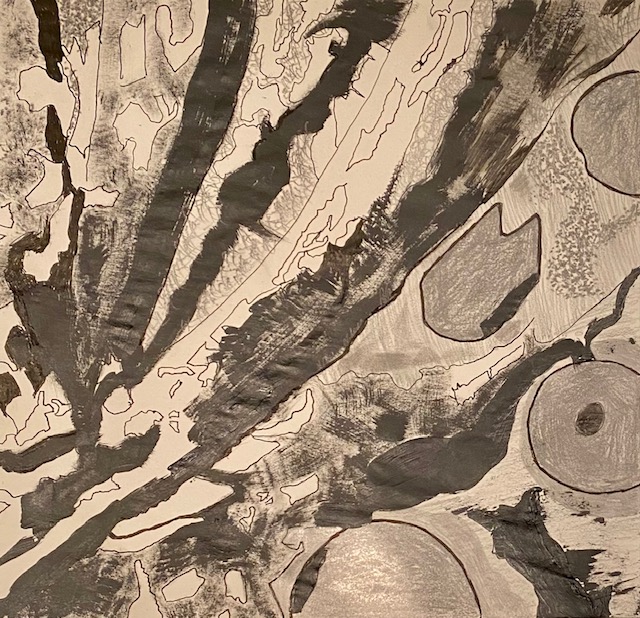
A3 square drawing above on newsprint. Black paint, half inch paintbrush. pencil, graphite and biro.
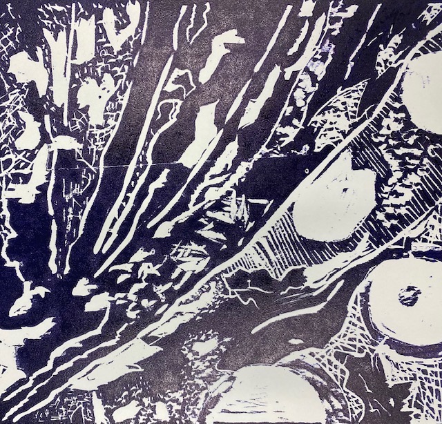
For this induction stage of the risograph I worked only with black ink. The risograph worked very well – picking up the various patterns from the mark-making and showing the different tones from the drawing. I made 25 copies so that I have plenty to work on in the next layer. The only thing the risograph loses at this stage is texture – juxtaposition of matt v. shine from the black paint and pencil. I think this IS a LOSS, since textural variety does add to the drawing.
I’m planning to go back to the risograph studio and build up some colour in these images – certainly pink and green, and maybe blue – depending on how many layers I can do – I’m not clear, and didn’t ask in the induction today, if there is a limit on the number of layers. (NB I could do a final layer of text)
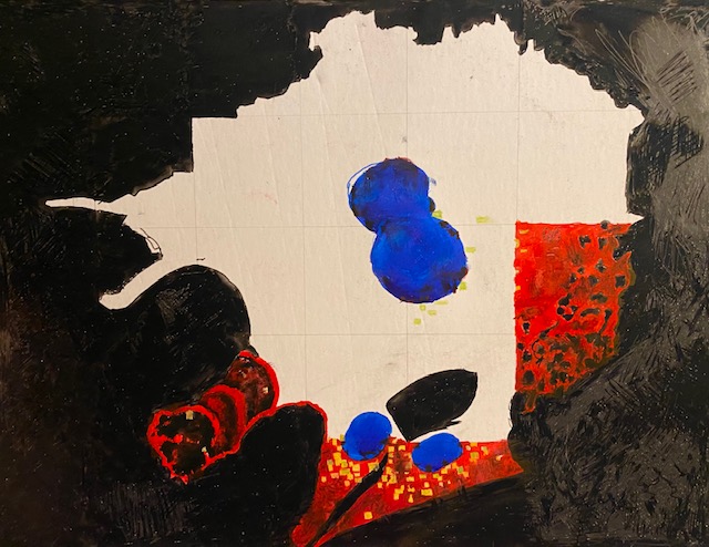
This is quite cool. Here I have made an A4 copy of the original photograph. Then turned the black marks on the second image above, pink – in iPhoto and printed that on transparency paper (computer graphix) in my inkjet printer, then printed the green separate version above, and layered them.I will use this experiment to see if I can layer these three images using epoxy resin.
Learning about epoxy as a layering technique: I spread a thin layer on the back of the first printed (green) computer graphix sheet and positioned the photocopied drawing underneath. I sprayed the photocopy with a protective coat first, but that really was not enough. I should have given it a thin coat of glue, but I was worried about the paper buckling. Anyway the layering worked – the two layers are fused together quite neatly. The interesting observation is that the soaked photocopy image itself became darker, and transparent so that the newspaper text, on which it was resting, could be read through both layers. This is a very cool finding because it means that I could use it as a deliberate method. This time I did not want newspaper text showing underneath so I changed the newspaper for a sheet of white paper and left the image to dry on that. I’m expecting there will be enough resin soaked through to fuse the white sheet on the back too (it did). If I don’t want the paper backing to become transparent – print the image on glossy photo paper, and also possibly give it a very thin layer of glue.
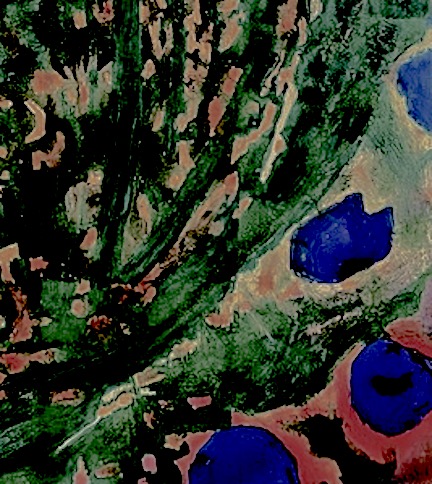
The second layer of epoxy was on top of the computer graphix, green, drawing. This time I found it difficult to get the image completely flat without bubbles of epoxy showing (these are visible in the photograph above but because of the design, not particularly problematic). I think this is because I am now fusing two non-absorbent layers together. I’m wondering whether the bubbles will disappear as the epoxy cures. My learning this time around is not to rush – epoxy has a long ‘open’ time – I think about 45 minutes. It’s impossible to get the three images completely lined up – but I think this is a fault in the original printing, rather than the layering process. I need to be more careful to print the images exactly the same size and make sure that I put the paper in the printer exactly straight. nb. Where the epoxy squeezes out of the edges and leaves a wavy line of resin, it is still possible to cut this off with scissors 16 hours later. I think it can take up to 3 days to cure completely. I’m also considering putting a further layer of epoxy on the front and possibly even one on the white backing.
I’m interested in how this technique can be used in collage. I’m planning to do some collage over the xmas break and I will experiment.

Completed A4 drawings with biro on PLIKE:
These drawings have taken quite a long time. I like them but I doubt they communicate anything to a viewer. Still they have been a useful starting point and might generate further work. The main benefit from drawing them has been time to think about my work, and I feel my thinking is now much clearer. I also feel much closer to pigs, interestingly. The idea of taking care and attention and bearing witness/gaining empathy has been forwarded during the drawing for me. So I have gained a lot, but I’m struggling with the issue of needing to explain visual art quite a bit at the moment, not only in relation to my own work, but other people’s too. I don’t feel it should be necessary. On the other hand, if not explained, this leaves work open to interpretation, and makes it ambiguous. This is generally considered as something to aim for (Barthes writerly texts) since it means the audience has to do some work to get at the meaning and interpret for themselves. Does political work need/want this ambiguity though? As a political artist you don’t want to leave doubt about your position because you don’t want to collude in a position that you strongly oppose. Maybe that’s why political art is not, seemingly, very popular? Also I note that artists we have listened to talk about their work this term have talked about its meaning in detail – even when it may NOT be political art.
Ideas for development
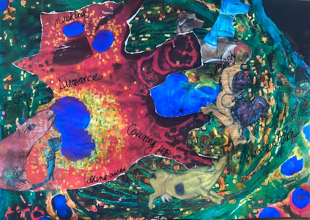
I like using collage, and I like incorporating text into my work, and above I am pleased I have done both. I also like combining the human and the pig cell into one image. I can push this further. On Tuesday I’m going to the mono print class in college and I’ll work on an image from this collage. I had forgotten how much I used to love these two expressionist painters. Their work is so beautiful and sensitive. I’m also pleased, given that the portrait work is going to be pretty dark and sombre, to contrast it with work that is colourful and joyful. It will be interesting to see how I can combine the two ideas (portraits and cells) more coherently going forward – I will think more about this. I think in the second collage it might be good to blow the appropriated images up bigger and also flip some of them around. Maybe start with the collage of animals and then layer the cells on top rather than the other way round. (print cells off smaller?). Writing this makes me decide not to use the butcher shop window work – see below. It’s too dark and the portraits are dark enough. I want this contrasting work to be beautiful and joyful. I also wish I had not added negative words, like ‘cognitive dissonance’ for the same reason. On the next version, if I add words, I will keep them more positive, like ‘connections’ or even ‘only connect’ (from E.M. Forster, Howard’s End). It might be quite nice to do the bottom layer with appropriated animals and do an image transfer before building up collage with my drawings. Lots of possibilities. At the moment it feels a bit like a whirling cosmos to me, which is nice.
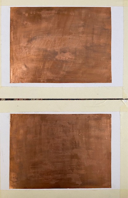
Drawings on copper
Preparation of copper for A5 drawings. The rationale for using copper is that it is an important trace element in the body for e.g. production of red blood cells, development of healthy tissue and organs (https://www.healthline.com/health/heavy-metal-good-for-you-copper#function), it is also very beautiful to draw on and I’m celebrating beauty of pigs and humans here. This copper is thin and easily bends. It is easy to cut with scissors. I fine sanded it to give the surface some ‘grit’ and then coated with varnish. Most artists using copper (e.g. George Shaw) paint over the whole surface with enamel, but I intend leaving parts of the surface clear of paint/ink. I don’t want the copper oxidising and turning green – hence the varnish coat. However I made the varnish very strong and it’s left quite a strong brown residue – so I’ve gone over it with a paintbrush dipped in Meths. Now I’m left with patches of brown and patches that probably have little or no varnish on top at all. It’s an experiment. We will see what happens – there is going to be very little copper uncovered and it may take years to oxidise. I glued the copper onto white card to give support/stop bending – the masking tape is to keep the card clean/give me a surface to rest my fingers on. I will also put tape round the edges of the copper to leave the copper edge clean – I’ve cut it slightly bigger for this reason.
Monotype
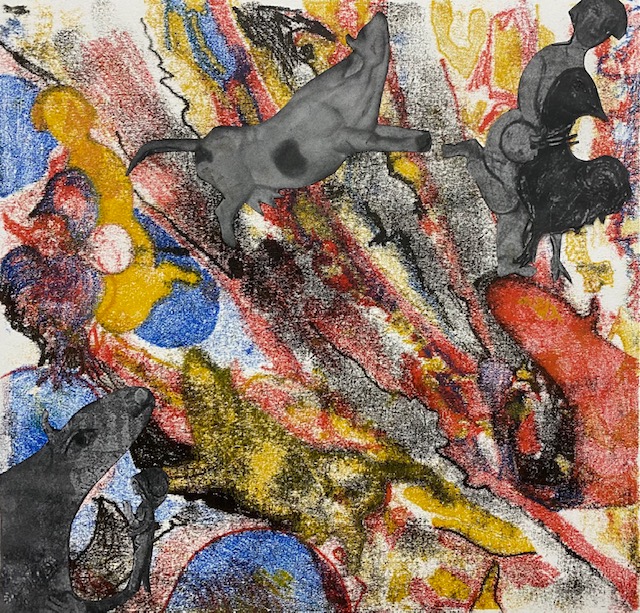
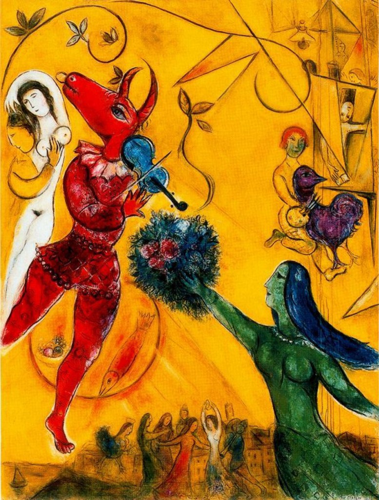
I used a photocopy of my pencil, ink, paint and graphite drawing (made for risograph) as the basis for a monotype. I incorporated the images from the collage into this (appropriated images are ‘The Yellow Cow’ by Franz Marc and the girl and chicken – and image from ‘The Dance’ by Mark Chagall. The cow image is also taken from a Chagall painting.
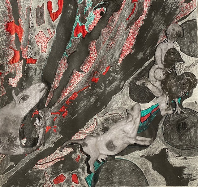
Above – black and white drawing made for Riso, above – photocopied and further drawn on with biro, pencil, graphite. Images are photocopied in black and white from the collage above and added later. I like this image better than the resulting monotype below.
Possibilities for development
1. Make with embroidery – perhaps miniatures.
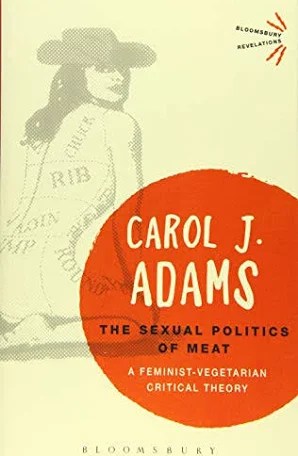
2. Using ecofeminist literature alongside the drawings. It might be quite interesting to place Carol Adams book next to these drawings if they were exhibited in public. (Adams argues that male domination and privilege underpins violence both to other animals and women. I could, transfer the image from the front of the book onto Dura Lar and layer it over an image or incorporate into the collage.
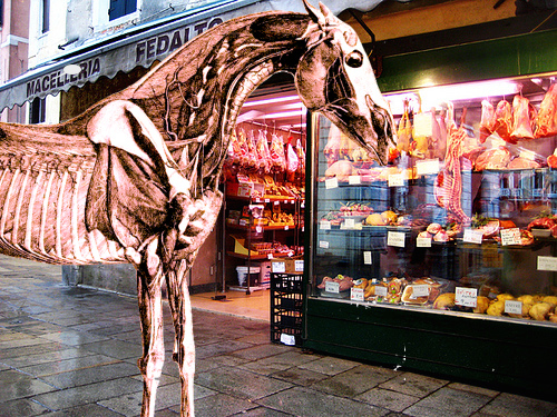
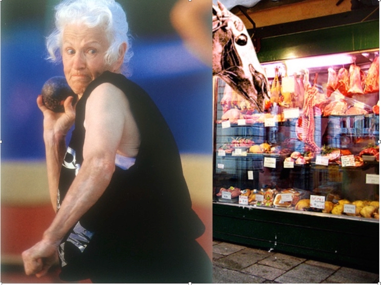
4. I thought that working on cruelty to animals on this current project was the first time I had explored this in my work, but then I remembered an idea I had a couple of years ago. The horse image is a Stubbs illustration that I worked on in photoshop and superimposed on a butcher’s shop. I was thinking today about building a third image that I would draw on Dura Lar to layer on top of the two previous images. Perhaps this would be an opportunity to try the epoxy resin. I would draw this third image in mostly black and white.Layering the shot putter on top of the horse on top of the butcher’s shop, maybe using DuraLar or image transfer techniques and drawing the shot-putter in charcoal, ink and graphite. I’m not sure whether I want to incorporate any images of dead animals in my work. – SEE WHY above.
5. Inspired by Chagall ‘the Dance’ (book cover for Isaac Bashevis Singer‘s short stories) – make the girl holding bird life size in paper mache.
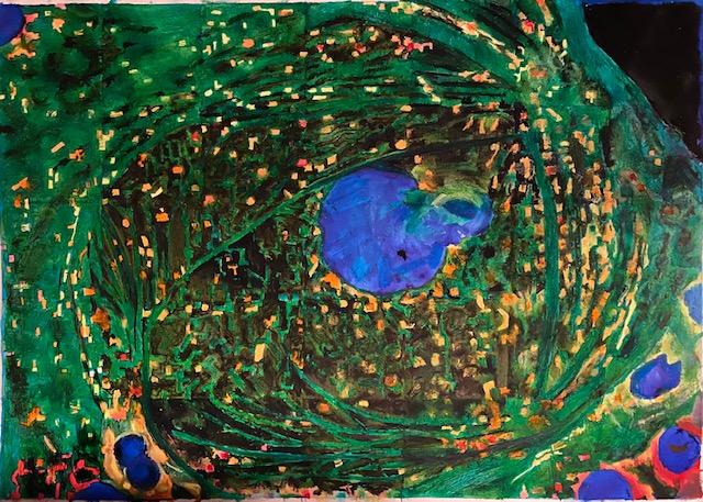
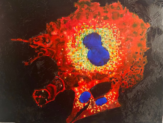
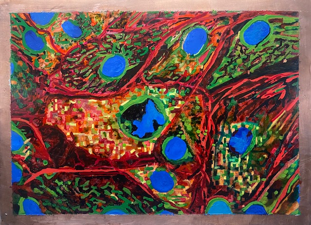
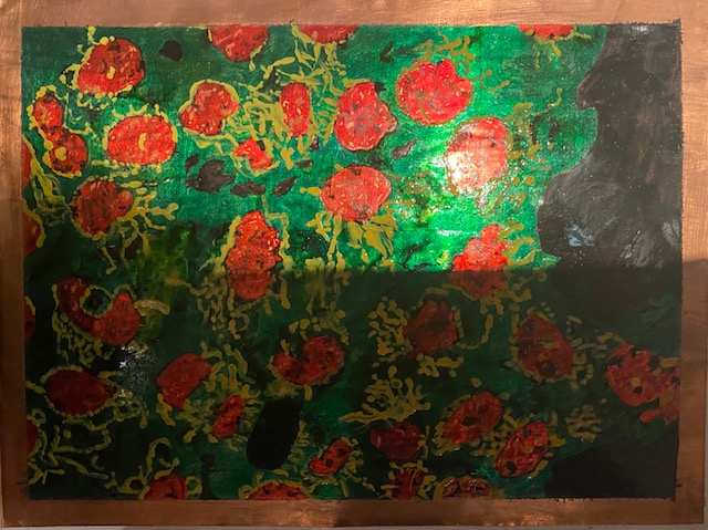
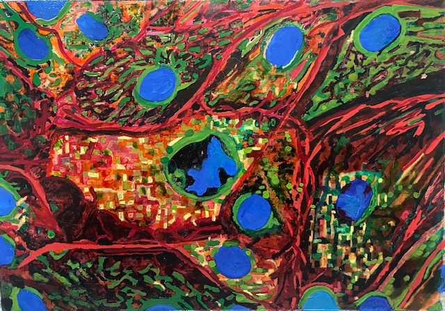
Gallery of images of cells

Reflection on learning
I was caught up playing around with these cells. I could play around with them for longer, but I need to move on. In themselves they don’t communicate anything about the connections between human and non-human animals, although I think the collages may get at connections more effectively. Nor do they communicate a critique of the discourse that humans are superior to animals. I have made decisions as a result of doing them though. I like exploring connections between humans and other animals. I think this is a positive focus that is not threatening or critical of people. I think these joyful images should be accompanied by less accusative text, e.g. Only Connect. Only yesterday I cam across the fact that this month’s National Geographical has an article on the emotions of other animals, which perhaps I can use. I like the way I’m beginning to bring both human and animal cells together, with images of humans and animals. Appropriation of images from another artist is only problematic, I believe, if the image is not acknowledged or the whole of the original work is copied (ref). I also like that the work is colourful and positive, compared with the portraits that I intend being in mostly black and white, and which are not joyful or colourful. I’d like to see this work side by side. With regard to learning about processes – Risograph’s are new to me. The process of making the risograph lead to thinking about how to layer at home without a risograph machine but using a similar process – I found I could get a good result with computer graphix which is possible to print on with an inkjet printer. I also experimented with putting these layers together using epoxy resin. Doing very fine detailed drawings with biro is fairly new to me. I like working small for the reason that this wastes less paper, less ink, and takes up less space in the world. I think that this is an important consideration with regard to art and ecology – it seems more sustainable to me. It is making me think whether in fact I want to make large portraits. Perhaps my small ink drawings (4 x 4 in)are big enough? I will consider this more.
References
Haraway, D. (1988) Situated Knowledges: The Science Question in Feminism and the Privilege of Partial Perspective, in Feminist Studies. Vol. 14. no 3. pp 575-599
Adams, C. (1990) The Sexual Politics of Meat. London: Bloomsbury Academy
