‘Collage is already an act of destruction’. Interview with Jeff Keen. Experimental filmmaker.
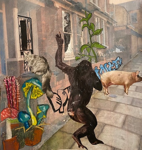
In this work I played with ideas involving a speculative future in which the human is demoted from his privileged position of superiority. In this speculative world it might be that other animals are the ones to help humans. I have wondered recently how we humans, who have done the damage in the first place, can imagine that we can change so much that we can put it right.
As this work progressed I found it shifted from a general focus on relationships between human and non human animals, to a more specific focus on the North Yorkshire landscape and incorporation of text. This allowed me to use fragments of my drawings and a poem that I wrote near the start of unit one, focused specifically on the experience of growing up on a farm there (although I should note here too that the first experiments are also personal in that they start with scenes from my current home and immediate surroundings).


I was thinking about how utopias seem harder to envisage than dystopias. There seem to be a number of ideas around about re-greening cities that have a utopian flavour, and I was going to work on that idea, only I felt depressed even thinking about it (see my writing at the end). Obviously re-greening cities is a great idea, as is thinking about community vegetable gardens and so on. But then I was thinking how much bigger our problems are than anything that can be solved by re-greening. for example, re-greening seems to me a solution to a first world problem, while in under-developed countries I feel pretty certain there is not a demand for re-greening as a utopian solution, but for the same materials goods that we have in the overdeveloped world.
I also think the re-greening solution is human centric, and does not begin to address how we exploit the land and other animals (I guess that it might be argued that it is more than human centric if it can make some difference to global warming, and some of the problems caused by fossil fuel production and animal agriculture).
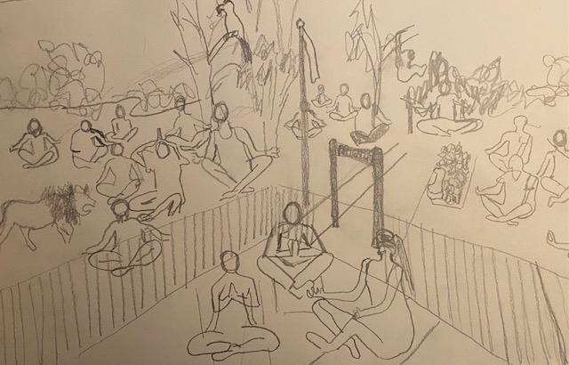
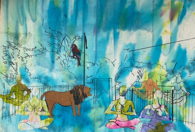
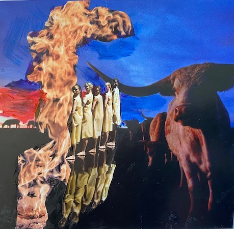
In the end I decided to focus on the park behind my house in Tottenham, which I have filled with people from all ethnicities, coming together to meditate, alongside a lion, a monkey and a parrot, on a world that is more just to all animals, all land and all humans. I feel that before we can begin to think about a utopian solution people have to change at a fundamental level, and that tinkering around with local improvements is not going to make the huge difference that is needed.


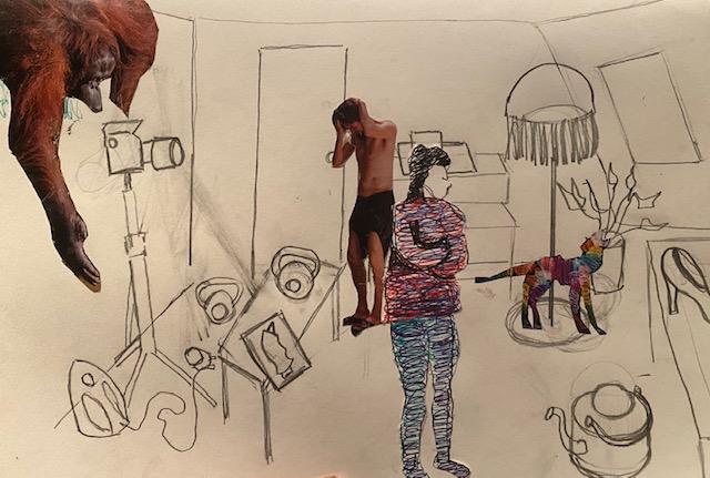
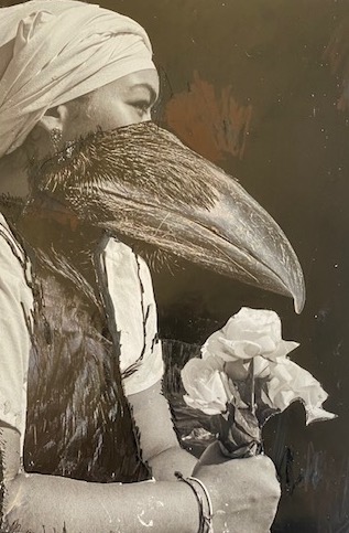
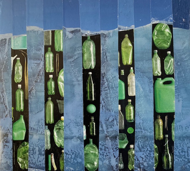
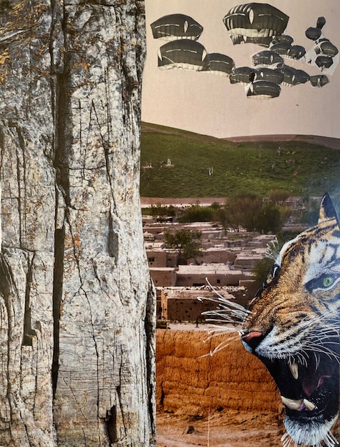
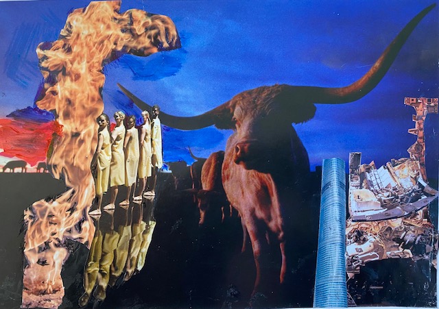
The six images below were made during the collage workshop with Kate. I worked quickly. I was mostly looking for images that I thought would work side by side in relation to colour. I was also looking for images of other animals, or human damage to the environment.
I guess I was also making choices based on pattern that I would like to work on – for example, the straw beneath the baby in image 2, the texture of the feathers in image 3, the texture of the ice in image 4 of the iceberg, the texture of the tree bark in image 5.
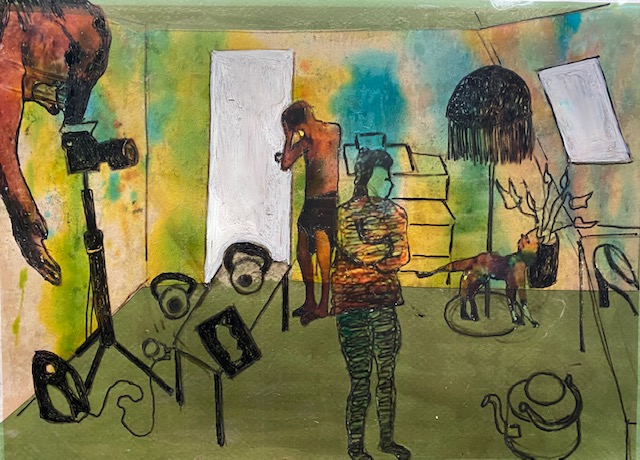
I have made some crops to some of the collages to make, what I think, are stronger images. see below:
I didn’t try all the methods suggested by Kate (slicing two images and placing one on top of the other, weaving, stitching, erasing, painting over, and placement of images side by side – but have rather boringly stuck mostly with the last suggestion. There might be obvious ways of developing the images that occur to me over the next few weeks:
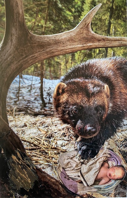

I prefer including drawing in my collages – or starting with drawing, and also using my own drawings/prints as the papers for the collage. I could go back and do this, using the images above as starting points. I’d like to work on the beaver? otter? with baby collage first. I could draw a bear rather than otter. (make some textured papers before start, perhaps using mono printing, and perhaps on Washi papers (which are nice and thin for use as collage and stand up to a lot of wet materials).
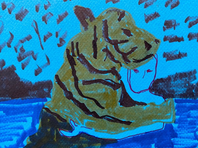
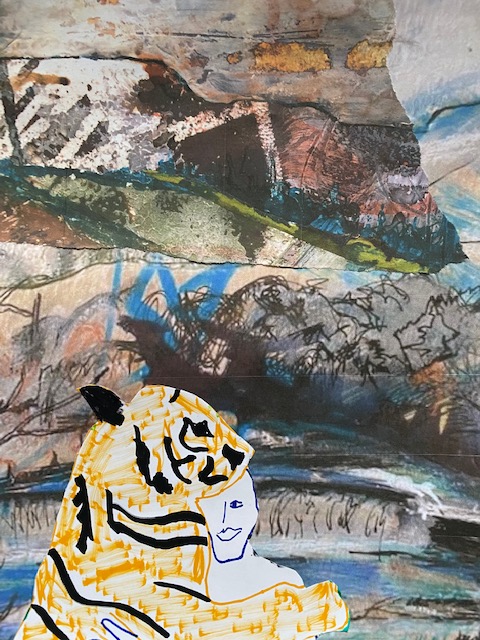
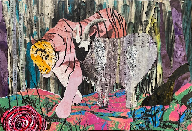
For the next series I decided to look at an unusual relationship between two animals (could be a human and non-human animal) – here a tiger and a goat. I started with a series of drawings using felt tip pen. These are A5. They took between 15 seconds and 5 minutes.
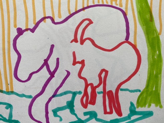
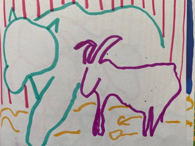
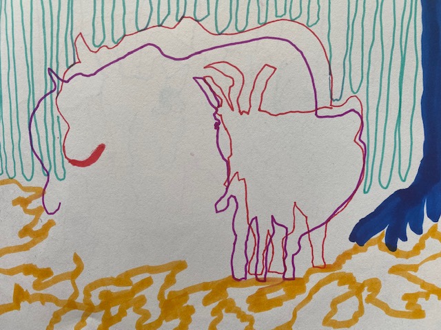
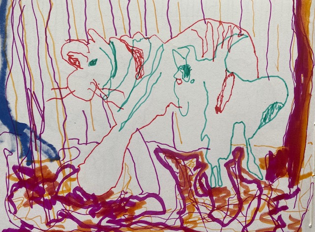
I like the bottom two drawings best. The one on the left was done with 4 single lines in two different thicknesses of felt pen. The one on the right was made by drawing with a pen in each hand at the same time.
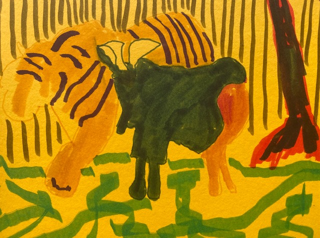
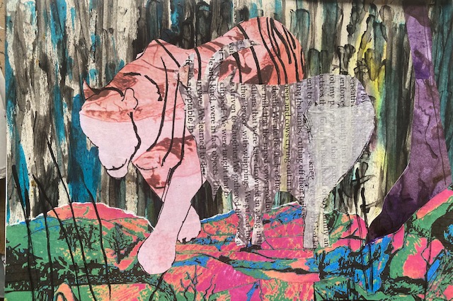
From here I started work on a collage – choosing papers from my scrap bag. This is an A4 collage in my sketchbook.
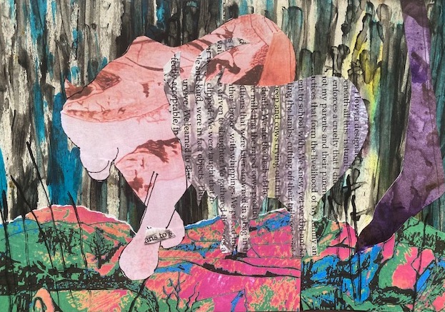
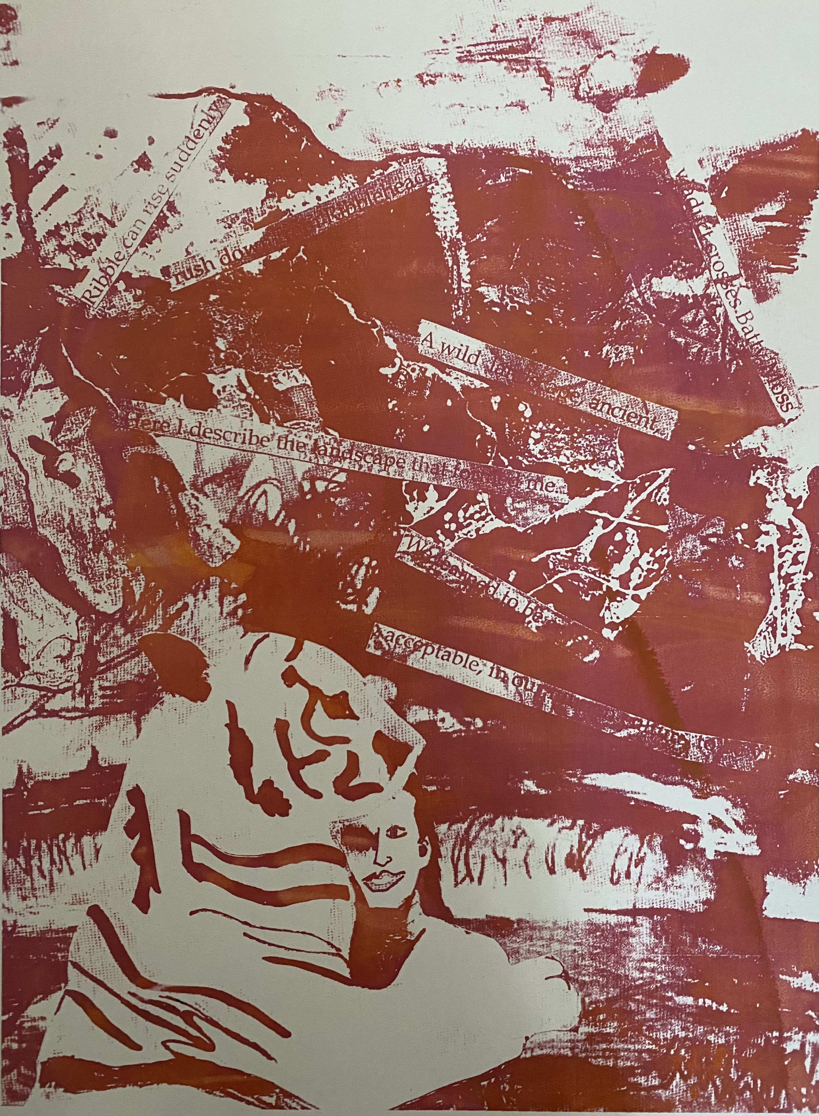
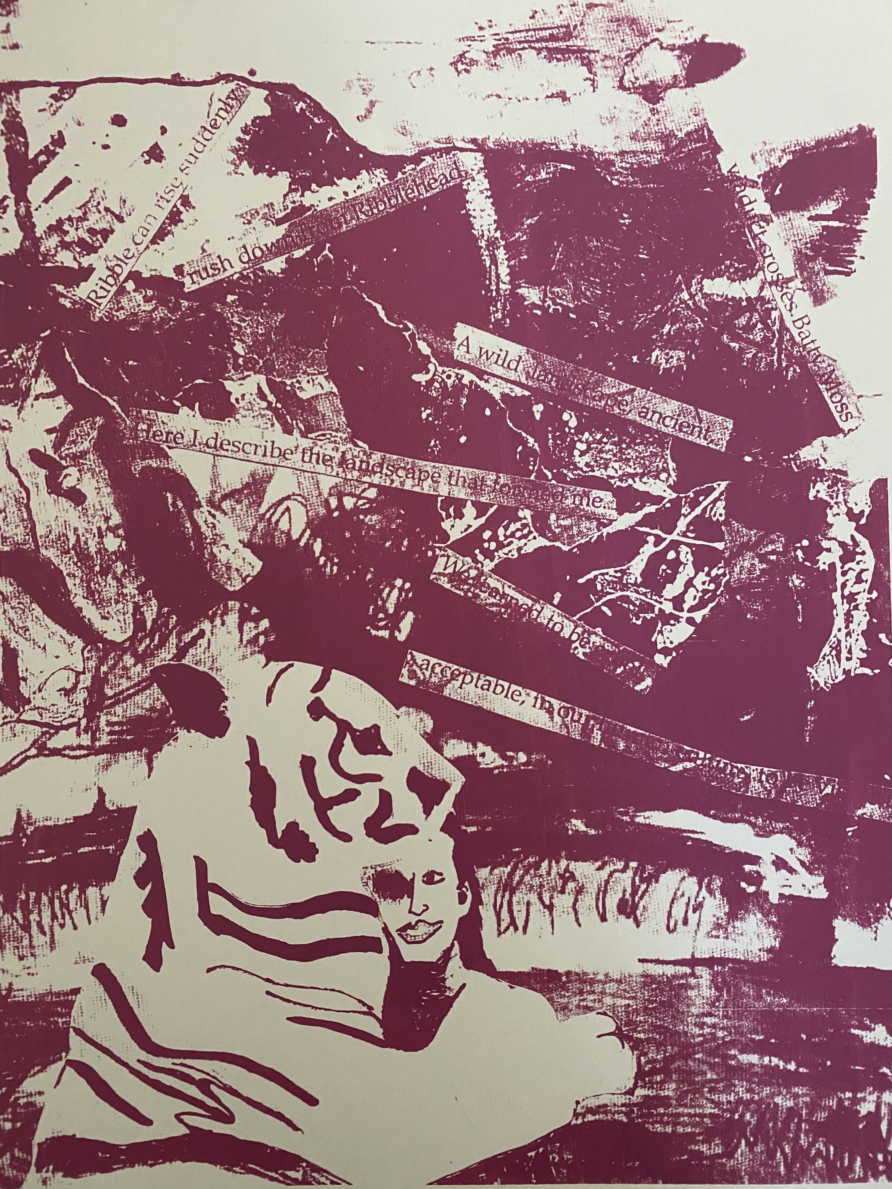
I used part of my poem about the landscape which I printed out on a drawing of the north Yorkshire landscape for the goat and in fact both the tiger and the foreground are print-off of drawings I made previously of the same north Yorkshire landscape. I like that this begins to incorporate part of me and becomes a self portrait The backgrouind is also part of a drawing in black household emulsion with ink that i did to the Vivaldi quartet, the back of which I have also used in the ‘Park’ collage above.
I’m wondering how to get some of the life and energy from the quick drawings into the collage? I think texture is one way. I also think that some blocks of plain colour in the drawing could provide more contrast.

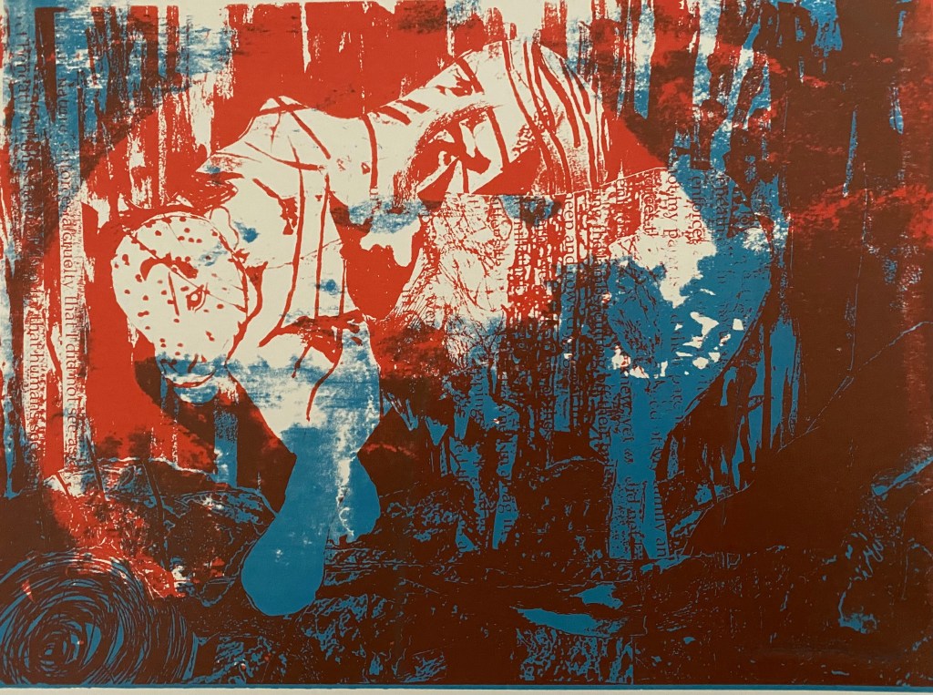
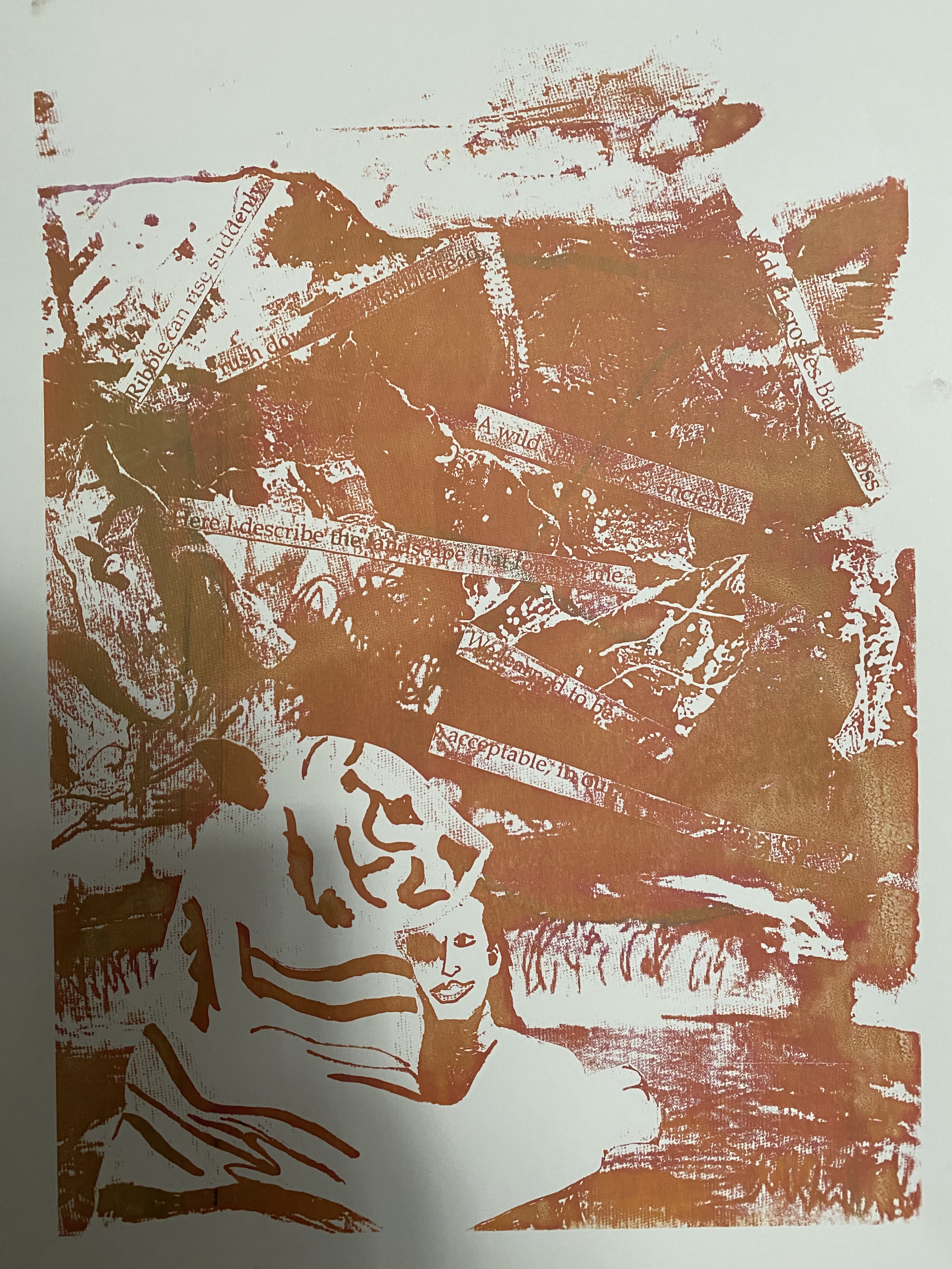
I have been wondering how to develop this and thought I would try screen printing- black and white version in preparation:
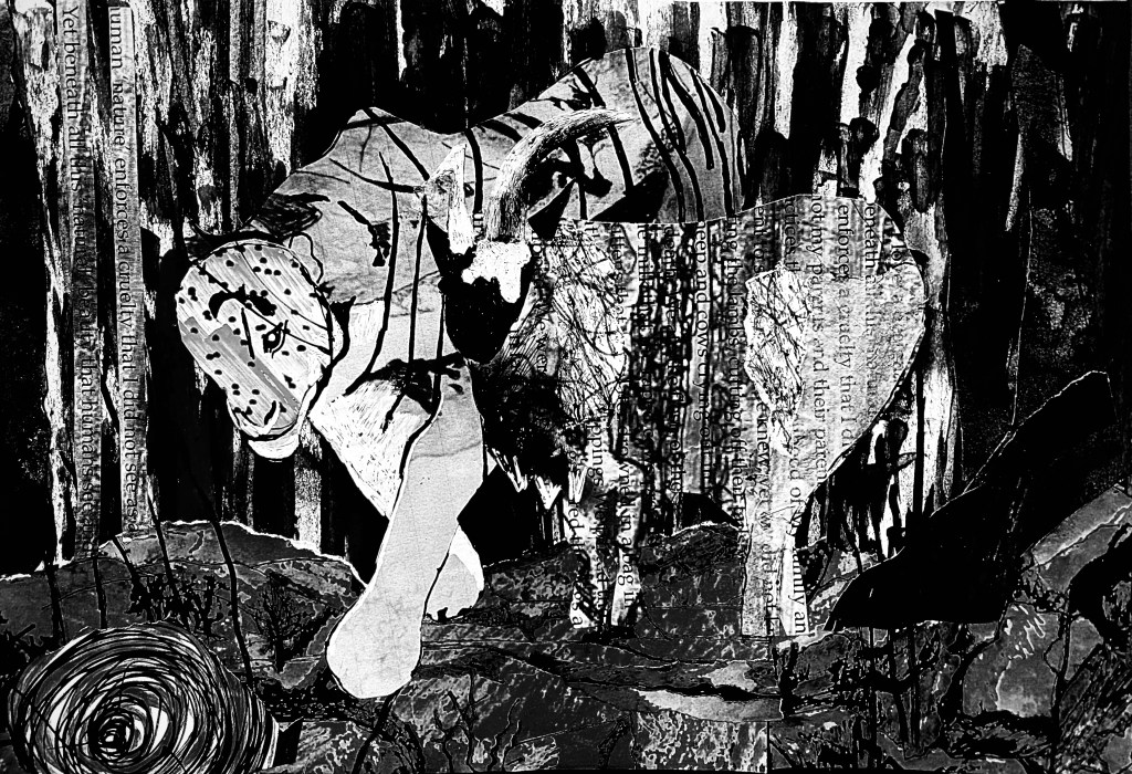
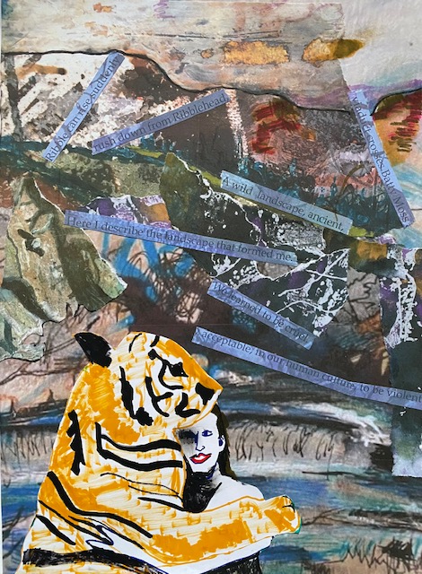
Reflection – I really like that the drawing references both the North Yorkshire landscape (the foreground as well as the tiger’s body are cut from previous drawings of the North Yorkshire landscape that I worked on digitally to change the colours). The background is my response to Vivaldi four seasons (winter), that I view as a self portrait, and the text is my poem about growing up on a farm and our treatment of other animals, printed on a drawing of the North Yorkshire landscape. I therefore feel that it is rich with references to me, my background, the land, and other animals/our relationship to them. I think this is fruitful for further development.
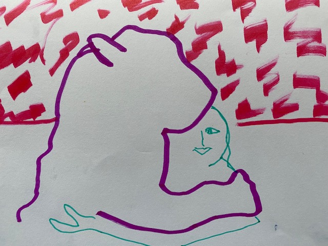
I started the collage below by photocopying drawings I have done before: all of the North Yorkshire dales. I also made 4 1 minute sketches of a tiger and girl hugging. I cut the last one up to use in the collage (so not shown below except in main collage, where I have worked on it further.
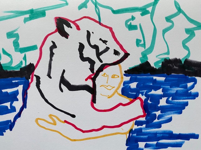


I like the last two ‘North Yorkshire’ collages as a pair. Maybe I should keep to the theme of a tiger in North Yorkshire?:
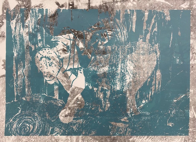
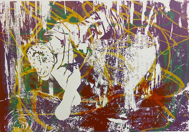
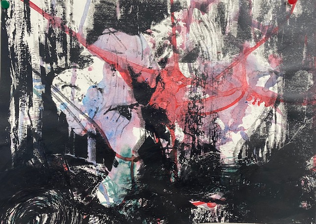
I used the black and white images to make many different versions as screen prints (about 20 in total). Here are 4 of these 20 versions of the tiger and goat below followed by 3 from the tiger and woman series:

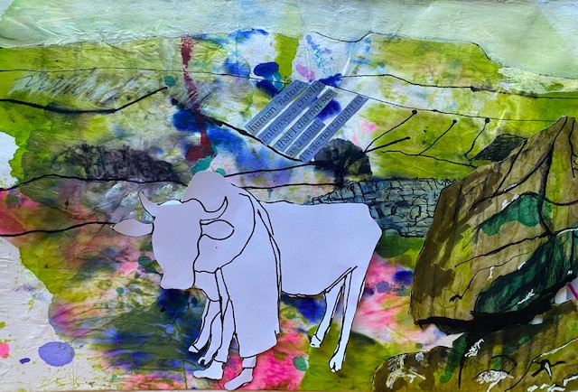
I have been enjoying focusing on the North Yorkshire landscape, and incorporating my poem as well as human and non human animals. I have drawn this landscape many times, and in many different ways (e.g. ink drawings, linocut, mono print, collotype) in the past and incorporating collage seems a good development. I started the next work with a quick drawing of a familiar landscape on Washi paper before I worked on it a little with a biro, felt tip pen and gouache. (I am thinking it would be good to develop lots of mark making on Washi to use as collage and have ordered some more for this purpose). I like the dry stone wall which is such a typical feature of this landscape (worked on first with biro and felt tip pen, then a coat of thin white gouache, then more working on). :
Next I did some quick drawings with felt tip pen – one is a single line drawing and one is drawn with a pen in both hands.
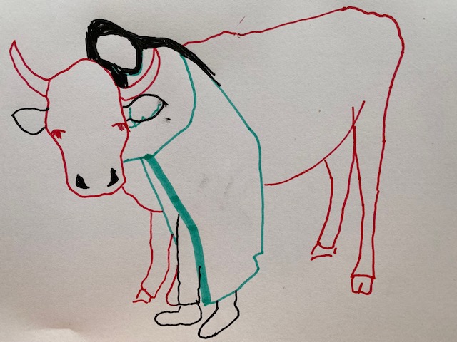
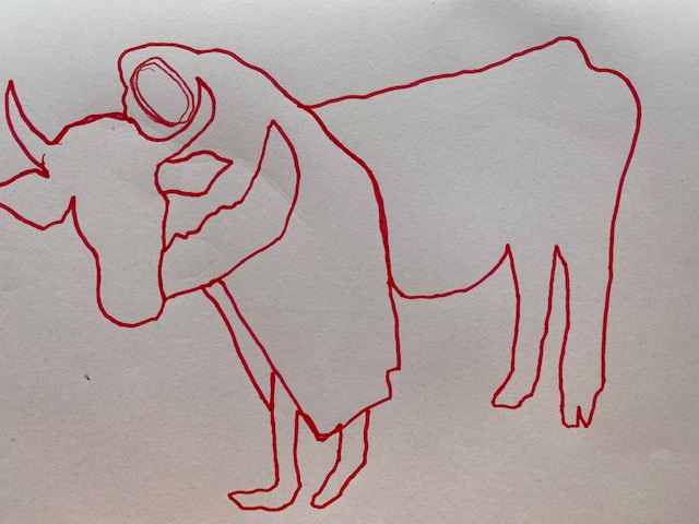
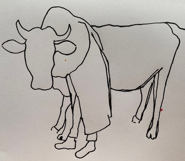
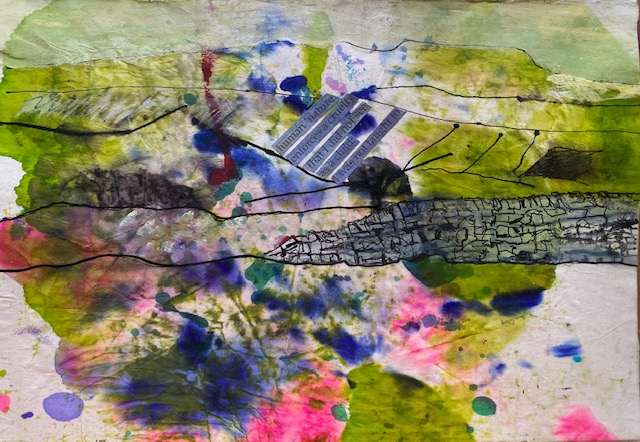
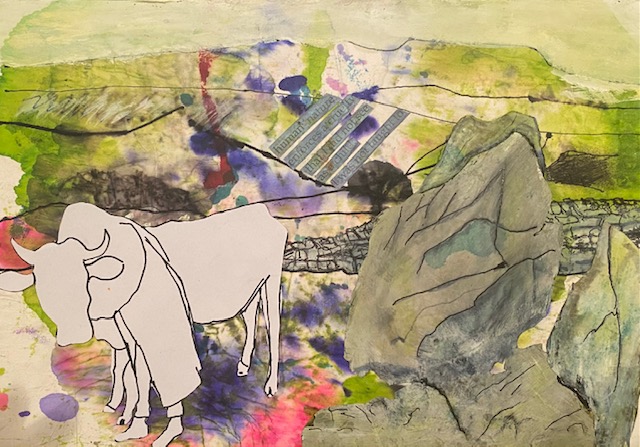
I cut out the cow and figure, and the rock – and played around with placement, before deciding I needed a second rock.
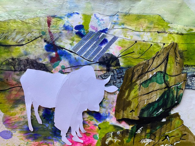
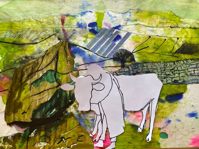
Below have made a new rock, as well as painted the original and new with thinned white gouache – over the top of apple green st. martens ink, alcohol green ink, charcoal, biro, tombow brown and sage – this gives a lovely grey/blue surface on which to work back into with biro. I have also painted over the strips of writing with thinned gouache and then ironed it – green from the iron has left some nice marks ghat make it blend into the background a little better. I don’t like the black dots made by the biro on the right and left of the first rock and anyway I think it should be higher so added to the rock to cover one of the marks.
I tried something a little different below because I am thinking already about our July exhibition of work for unit three and wondering whether my focus should be on the objets I have been finding on eBay. I drew some of them for the miniature project but wondering how a focus on colonising objects might be developed. I thought that a cut out collage might be interesting:
I’m thinking in the text of the Bargehouse installation and text I am using there from John Berger (1977) ‘Nothing is so marginalised and invisible in human culture as the animal.’
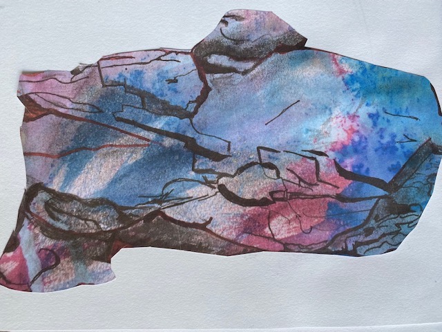
I like the inclusion of the erratic above. This is very evocative of the North Yorkshire landscape. Today I cut out and tore up bits of paper from previous drawings and arranged them into 5 piles of 50 different papers for collage. Then I selected 2 of my favourites from each pile, so I had 10 papers. Then I seated 5 favourites from the 10, then finally my favourite – it was actually a cut out image from an erratic drawings – I HAD NOT DECIDED ON THIS FROM THE START, IT WAS AN ARBITRARY EXERCISE. Here is the favourite:
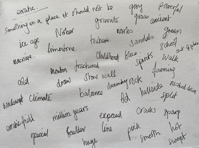
Next I brainstormed words connected to the erratic field (I discovered only this weekend that erratic does not mean ‘precarious balance’ as I had thought, but an object in a place to which it does not belong.
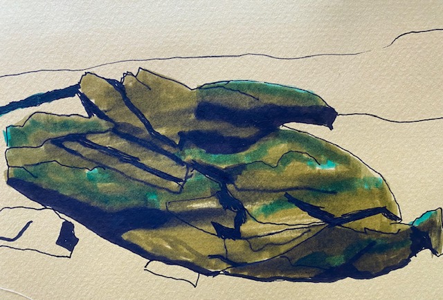
Following this I prepared 5 backgrounds that I was attracted to all as A5 papers. I worked on the erratic on these and developed each one in response to the previous one. Here they are in order:
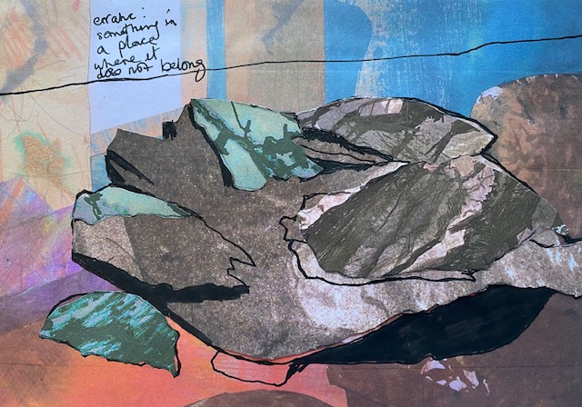
What I really like about this is that the erratic is collaged on top of a previous collage of my parents sitting room (when I chose the background, I had not even remembered this because it is a photocopy of the collage and I chose it purely because I like the colour and pattern). So an erratic in my parents sitting room definitely does not below, and would indeed take up the whole space. However, my parents cottage does lie at the bottom of `Norbert where the erratic field is – so perhaps the erratic has bounded down the hill and gone through their ceiling!
I continue working on top of my parents sitting room – this time the background is the upper half of the previous collage and the ceiling has wooden beams across it.
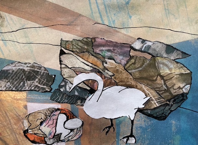
I didn’t want to stray too far away from the idea of ‘different’ relationships between animals. So here we have an erratic in my parents sitting room, together with a swan and a swaddled baby – non of which belog there! The whole of the rocks, as well as the swaddling cloth are collaged (as is the background from previous work). I really like this although it might be meaningless to anyone else.
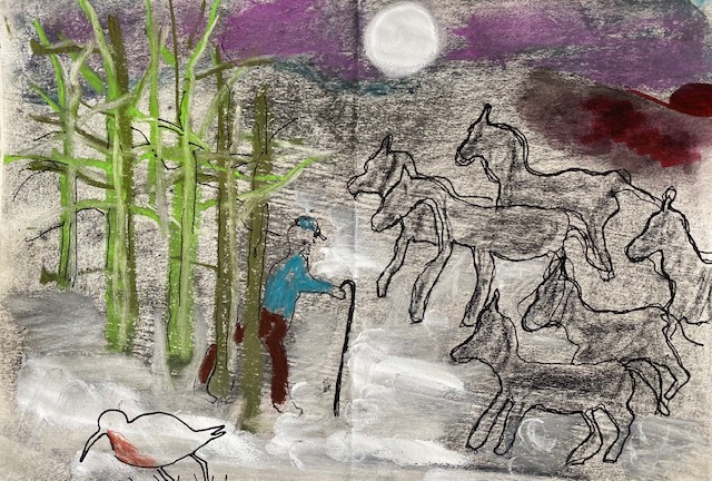
I want to look at Ted Hughes poems about animals in the next work. Apparently it is world poetry day today (21st March 2023). I don’t know his poems so I chose 3 at random (Horses, Amulet and The Thought Fox) and began by drawing a 10 minute response to each:
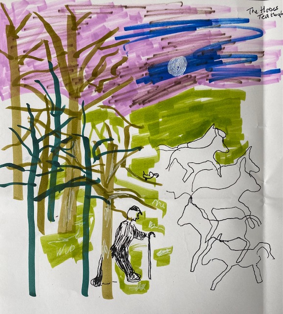
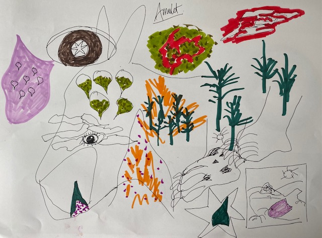
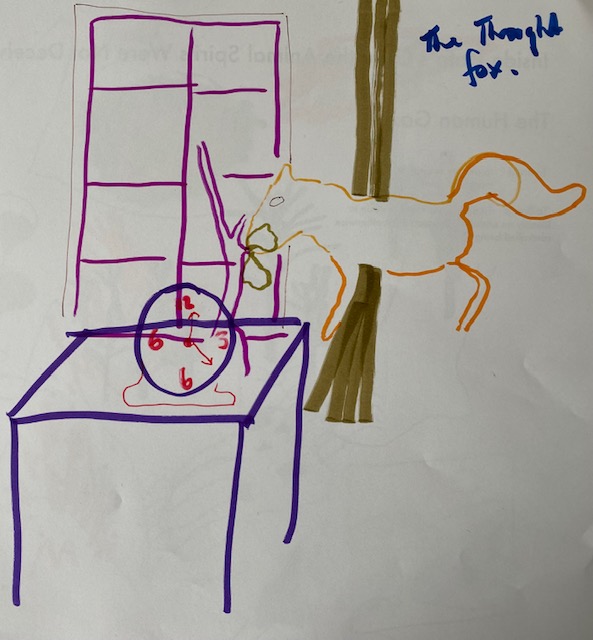
Each poem is beautiful. I love the mention of frost, red sky, and 10still horses with curlew in ‘The Horses’. In ‘Amulet’ I love the circular nature of the poem and one thing being inside the next. In the third poem ‘The Thought fox’ I like the mention of the fox touching the branch so lightly and the clock ticking.
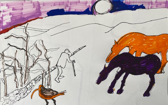
I’d like to work on each of these poems but I will start with the one on the left. I responded to it with different mediums – chalk pastel and did another 5 minute drawing. I like the colour of the sky here and the darker feel to this, along with the snow. The poem has a strong feeling of coldness and frost. Maybe in the collage place this in the North Yorkshire dales and incorporate some of my own poem.
Another 5 minute drawing, trying to get a sense of the North Yorkshire Dales. I think I have enough info here to start a collage.
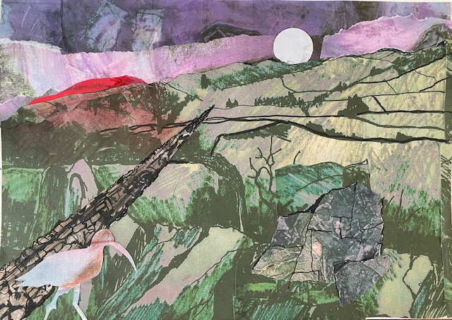
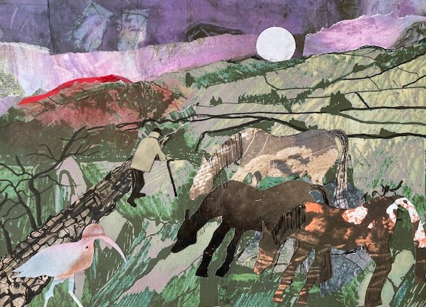
I made a start on the collage below using cut up drawings that I have done previously of the North Yorkshire Dales. There are some erratics in the foreground but I think they will be largely covered over.
I like the colours. Too much red – should just be a sliver as the sun rises. I don’t like the wall – it looks flat. I like the curlew and the moon. nb. the wall doesn’t work – do something about that.
References
Lola Olufemi (2021) Experiments in Imagining Otherwise, London: Hajar Press.
Avani Ashtekar (2022). https://blogs.lse.ac.uk/lsereviewofbooks/2022/07/15/book-review-experiments-in-imagining-otherwise-by-lola-olufemi/. (Accessed 1 March 2023)
Berger, John. (1977) Ways of Seeing. London: Penguin.
Max Haiven (2014) Crises of Imagination, Crises of Power, Canada: Fernwood publishing.
