This exhibition contained drawings by many famous artists and it was interesting to see how many of the drawings were radically different from previous work I had seen by them. I have made choices below based on one of three criteria: 1. the process used was something I’d like to explore more myself, 2. the subject bore a relationship to subjects I am interested in. 3. the drawing is by an artist that I know, but this work was rather different from previous work I have seen. 4. I just liked it.
I am going to organise the works I photographed under these headings above. The photographs are not great – it’s difficult to photograph works behind glass with lights shining on the glass, but the blog is to remind myself of what I saw and my responses
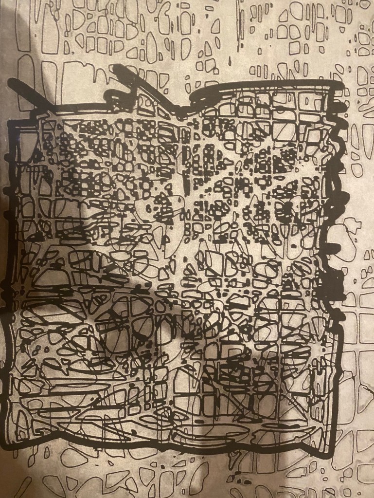
- the process used was something I’d like to explore more myself
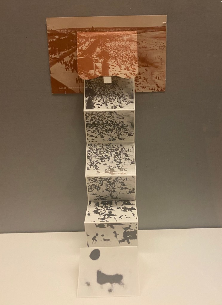
This work fills categories 1. above but also 4. It starts with an old postcard of Whitley Bay, with a flap. cut out of it. I really like this. It is small – about 6 x 4 in (postcard size) and the images are smaller. It starts with a drawing of the beach and each following image is a closer view of that beach until we end with just a blob. I think this is so clever. I also think that the packaging is clever. I like books and I like small works. I guess I appreciate the mark making, and its cleverness, consistency and logic more than the subject matter. But generally I like it a lot.
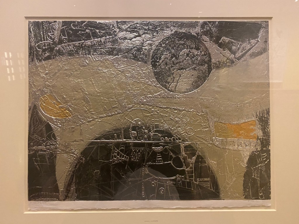
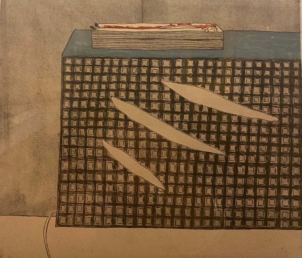
I’m interested in, and use layers quite a lot myself. Here 2 layers have ben built up using chine colle which is not a technique I have used but I think I can achieve the same effect with dura lar. For me, Layering brings up ideas about history, ‘masking’ – one thing covering another, memories. It reminds me of the drawing I made of the masks and rubber gloves on the pavement. I like a subject/content in drawing and this is more concerned with process. I think I understand this as a print layer, a layer of very fine Japanese paper, followed by another print layer, and (I think) a final layer of Japanese paper.
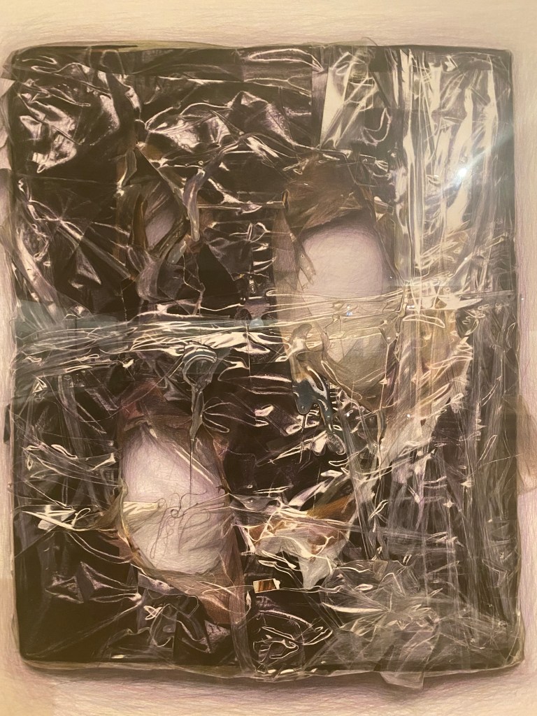
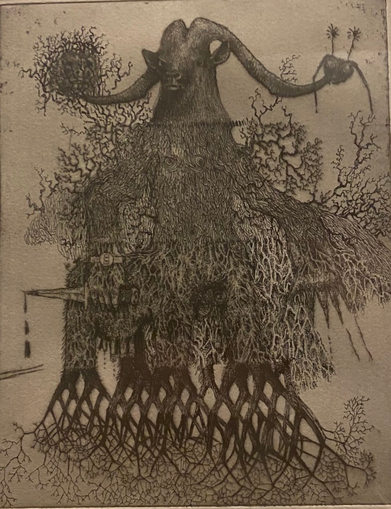
I found this work quite compelling. I like the colours and was interested to see how it was made. I see the in fact it is coloured pencil on paper. Hard to believe! He starts by making assemblages from everyday objects, and is concerned by capturing light, texture and reflection. His assemblages often include ping pong balls which he binds with tape , cellophane and glue. He then photographs his work and makes drawings from the photographs. I really like this. Beautiful drawing.
2. the subject bore a relation to the subject I am interested in.
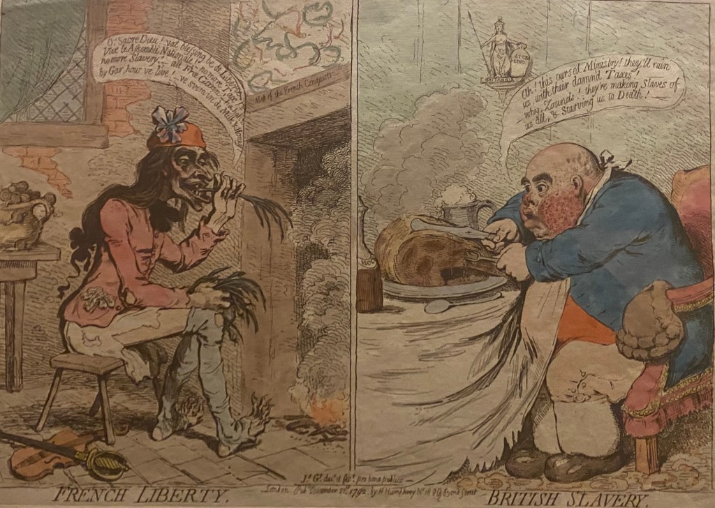
The British Museum apparently holds 20000 British satire prints from the mid 1700s to about 1830. Here Gillray lampoons the French Revolution and its British admirers. I like it for its critique of values and discourses at the time. I guess this kind of satire was taken over by the cartoonists in contemporary media. I’d argue though that the cartoonists of today take on much ‘safer’ topics by aiming their satire at individuals – I think they are an easier target that social values, the establishment and economic policies.
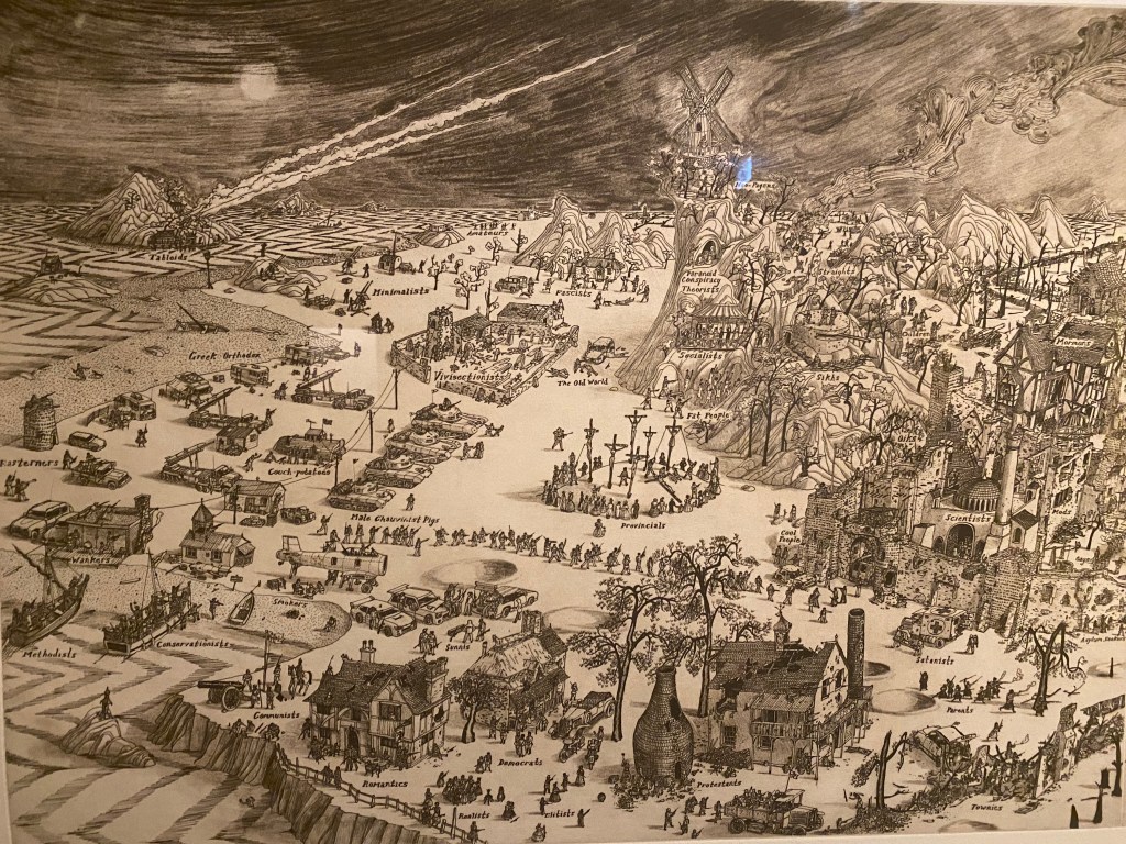
I know Grayson Perry for his work on vases, and have seen a drawing by him in the British Museum drawing exhibition before. this work is quite different, although again it is concerned with social critique. Here he seems to suggest an endless battle of people with different social positions and different identities in contemporary Britain, but set in what looks like a medieval townscape. I like the detail. I’m not convinced that depicting these groups at war is a subject worthy of so much labour – but Perry obviously felt it was.
3. the drawing is by an artist that I know, but this work was rather different from previous work I have seen.
This print was apparently inspired by an aerial view of the landscape of California where Diebenkorn lived and worked. I have included it here, not because I like it particularly, but because I’m a big fan of Diebenkorn’s figurative drawings. I don’t know what to write about it. For me it holds little interest in either subject or process.
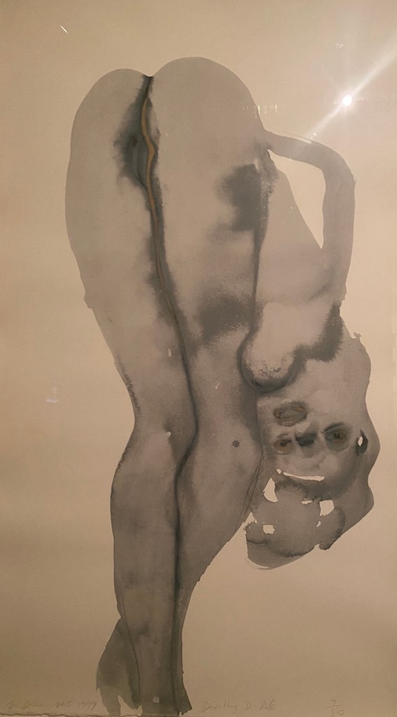
Dumas is an artist I really like. Her saw a major exhibition of her work a few years ago and have the catalogue from the exhibition. She often paints political subjects and is one of the artists who I refer to in relation to painting people who are protesting. She also uses photographs as her reference points, as I often do too. I’m interested in this work because it is a lithograph, and I am about to learn about lithography, and also for the erotic pose she has made, presumably from pornography, which I know she often uses as reference material. I have read she is interested in the way that pornographic photographs of woman often ask them ‘too show everything at once.’ The image is obscene, not because it shows her vagina, but because she is a woman objectified – a thing. Her gaze is straight at the viewer. I’d disagree that this is ‘the female gaze’, which in feminist theory relates to woman having agency. This woman might choose to sell her body , but in reality, she is a victim of capitalist values/commodification, where everything including our bodies, can be bought and sold.
4. Work I just like for one reason or another.
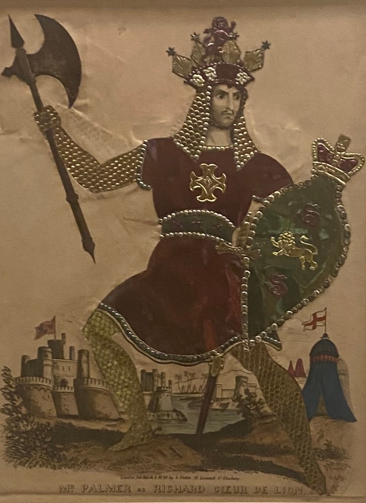
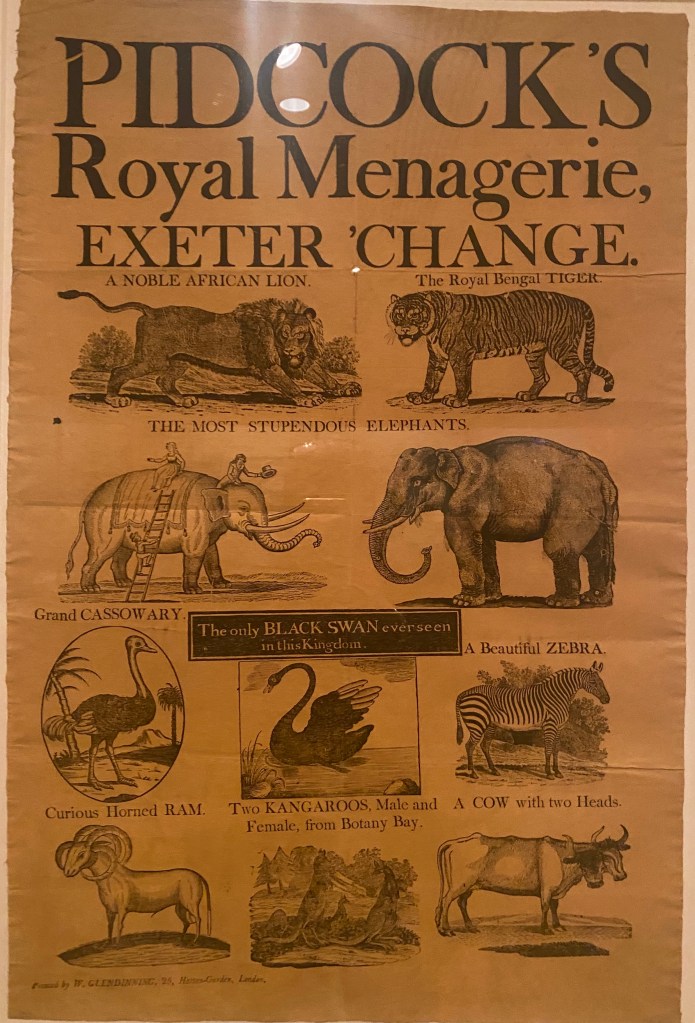
This is about 8 in x 10 in. I can’t work out how it is made. It has a lot of shine – the red gown looks like tin. It is described as a toy theatre print – replicas of popular plays sold as printed sheets to be assembled at home, including stages, scenes, costumes and characters. The characters were hand coloured and often embellished further with tinsel – as in this example – BUT I cannot see any tinsel on it.

Beckett was apparently a good friend of Arikha and the latter made several portraits of him. This is one of two portraits I liked a lot by the same artist (the other one a self portrait). Here, I like the way the artist has used the ink in a quick and confident way to mold the features of the writer.

Kathe Kollwitz is another artist I really like. I particularly like her subjects which often focus on critique of the system, particularly subjects of war, and personal loss from war. And here is another lithograph! The curators note gives the information that Kollwitz is still one of only 2000 artists in the prints and drawing collection at the British Museum with 30000 male artists represented.