I met three peers at the exhibition and we all agreed that we liked the work a lot. I liked it because all works were on paper, most works were mixed media, and all works were clearly drawing, which could not be said about our mini exhibition at college recently. (I have mixed feelings about a drawing exhibition that does not incorporate what most would recognise as ‘drawing’. I feel on the one hand that once one graduates from a ‘Drawing’ degree it matters not a bit whether one makes works most would consider to be ‘drawings’: one could make sculptures, photography, ceramics, textiles – any creative work, the kind of degree one has done after leaving college is irrelevant. On the other hand, there is an MA Fine Art pathway called ‘Drawing’ at Camberwell, which we have chosen and been accepted on. If it does not matter that something called ‘Drawing’ is evident in our work, then I think the pathway should not exist and there should be one programme called ‘MA Fine Art’. Presumably the pathway exists because while on it, we are expected to ‘Draw’. I also understand that drawing underpins other creative works. This ‘expanded’ field of drawing, should though, in my view, clearly link back to the drawing that lead to it.)
I limited myself to photographing ten works from an exhibition of hundreds of works (And I could well have photographed dozens – in fact a couple more have crept in). I went by my gut feelings – there was something about the drawing that interested me, and this ‘something’ relates to my own work. While I did appreciate the different mediums used in the drawing – graphite, coloured pencil, ink, soft pastel, oil pastel and gouache were there in abundance, and quite often used together. Different printing techniques were also employed quite often. And I noted the omission of mediums and materials that I think could have made the exhibition richer – particularly I noted very little or no use of Text; very little use of collage; little use of layering techniques (including for example using dura-lar or gouache or tissue paper to layer). I also noted that the exhibition made a statement about the works being ‘works on paper’, and while I recognise that a criterion of a ‘drawing’ may be that it is on paper, I disagree that a drawing must always be on paper. I did not see, for example, any drawing on copper, slate, fabric or even cardboard or Japanese papers (although coloured paper was occasionally used). Generally my comments here relate to my feeling that, while I liked and appreciated the skill in many of the drawings, I also felt that the exhibition generally was fairly conservative, and could have shown more experimentation with materials. I particularly noted that there was little evidence of thinking about how use of materials and visual image can be coherent and complement one another.
Below I present the ten works I chose, with the reason for my choice.
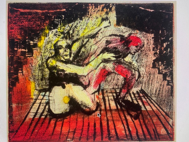
I was interested in Ella Wright’s work for a number of reasons. She very often seems to use a scratching technique in her work. I am interested in her subjects – I understand proscenium to be a social construct dividing the actors from the audience. I’m interested in her limited palette to black, red and yellow. And I’m interested here in her use of mono print with drypoint etching. All of these are things I have used before and want to remind myself of this, including drawing from film, which is something I have done quite a lot of, and could continue to do in my current work.
2.

I chose this because I like the contrast between the grey toned pencil work and the tonal work in the coloured section with oil pastels. I think the juxtaposition of pencil with oil pastel gives interesting texture and pattern. Oil pastel and pencil are mediums that I don’t think I have tried together before, and I will.
I chose to show another work by Sophie Nicole Dodds here. This one is with pencil and chalk pastel. I chose it for the same reasons above. I very much like the detail and delicacy in her work – the photograph doesn’t capture it. I also like the blank spaces – something I rarely leave. Sophie trained as a textile artist and this focus is clear in her work.
3.
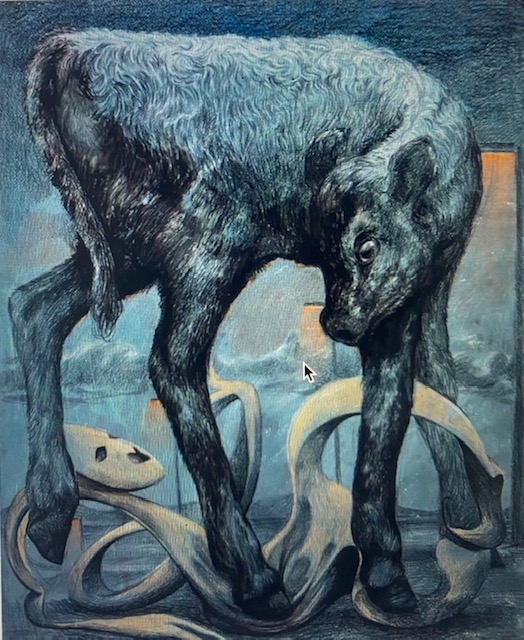
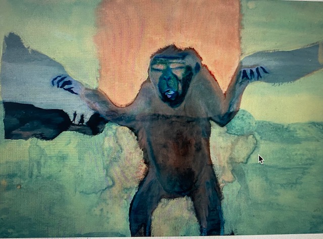
I found Louise Reynolds work the most inspirational. Not only for her beautiful depiction of this calf in watercolour pencils, but also for her other work and general interest – which she describes as ‘combining prevailing and fad narratives into visions of dystopian present and future.’ I’d say this encapsulates pretty much what I’m interested in too, although I think she expresses it in a far more accessible way. She also mentions the new in relation to this narrative (or I’d describe it as ‘discourse’). It’s interesting that before I read this, I’ve been thinking about the role of dystopian and utopian visions in my work – certainly some of the books I included under the ‘influences’ section of this blog are by dystopian fiction writers. And much of my recent work has been about dystopian narratives fed to us by the media. I like Louise’s use of colour here and very limited palette – I’m wondering what colour paper she started work on – could it have been the orange showing through on the upper right? I’m also wondering whether coloured pencils, e.g. Inktense, would work on top of copper? I will try them out. My final thought about this work is to wonder whether she is commenting on the plight of other animals – I think so. And she does it in a delicate, non didactic way – something for me to learn from. nb. come back and look at Reynolds work again and include it in the section on artists that are inspirational in Unit Two.
4.
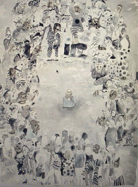
This is a poor photograph. The work does not have lines running down it. I like it for its humour. Also because spectatorship is something I am interested in, for example I made a series of drawings based on Kafka’s ‘Hunger Artist’ in which people are looking in on the starving man. Voyeurism in society is definitely something I am keen to comment on through drawing. Sutton writes that her drawings focus on alienation and social obsession with youth. In fact the drawing powerfully reminds me of ‘The Lottery’, famous dystopian short story by Shirley Jackson in which there is an annual lottery where everyone in the town draws a straw to find out who will be stoned to death this year. I imagine the crowd here are about to stone the baby. The title adds to this impression! l Like the use of black and white here. I like the pattern. I like the use of collage. All things for me to remember.
5.

Another poor photograph. With lines on the drawing where they do not exist!. I chose this work because I’m interested in the pattern and colour gradations that Jake has achieved by combining oil pastel with soft pastel. This is not a combination that I have tried, but I will experiment with it.
6.
Another beautiful work. Raha’s work has much I admire. I like the colours, again. I also like the simplicity, and the ‘thinness’ of the application – it looks like watercolour, but says mixed media so perhaps also ink or gouache. I like the washes of grey/blue that seem to extend from the arms, almost like wings. I think the work has a lot of emotional depth and is worked with sensitivity. I notice Raha has made several animal studies. see her ‘Debate on Msyogeny’. I like her humorous titles. See another of her works below:
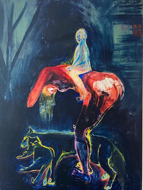
This work is so interesting. Love the way she has outlined the legs in pink and yellow, and the cat and dog in yellow too. I also like her use of red for the shadow beneath the dog. What on earth is that child, who has a face of a rather corrupt old man doing sitting on her back? So nice to see the cat and dog feeling very close to one another. The small red window in the upper right corner also works well.
7.
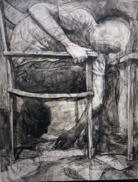
I think this is a beautiful delicate study. I particularly was interested in the use of soluble graphite with ink. Soluble graphite is something I use but I have not used it with ink and I’m not sure how he has used it here either. I will need to experiment. There is a beautiful sense of layering and I’m wondering if he made the drawing in ink first and then when dry, went over the top drawing with liquid graphite – it might be another layering technique I had not thought of! There is almost the sense of a layer of fine black gauze draped over the work.
8.
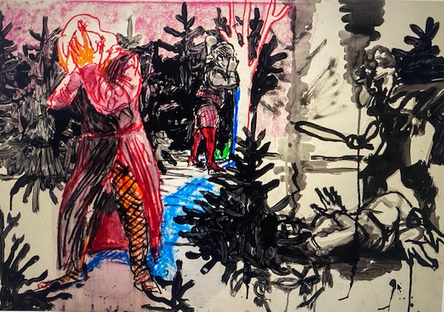
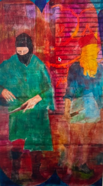
What is going on? I love the sense of narrative here. It seems to involve a violent attack, yet there is something funny about it. The two standing women are clearly on a night out in their fishnets and mini skirts. The one in the foreground seems to wear no shoes. They both have their faces covered. why are they not helping? Or running for the police. There are a lot of unanswered questions, and this makes it interesting. I like the quick loose marks – perhaps made with acrylic pens and ink. Interesting that there is no colour in almost half the right hand plane. It’s almost like a separate picture, yet it works. The single dab of green draws the two halves together. Fantastic .
9.

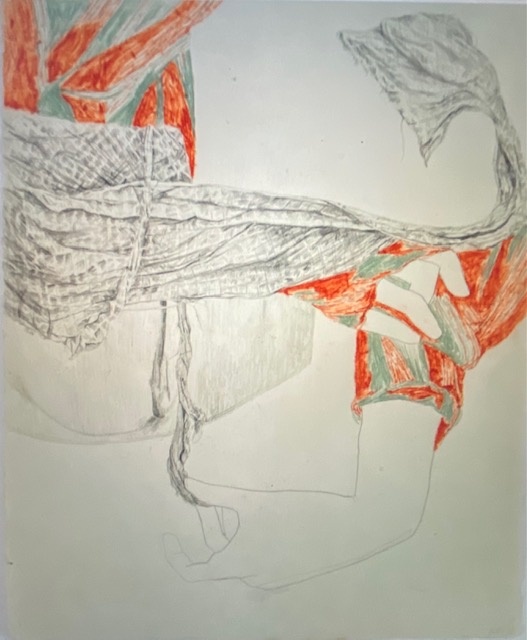
On Buhat’s web page he says he clearly and confidently used collage in his works but I am not sure that he has used collage here. Unless the pink on the left is a piece of collaged tissue paper with some blue showing through. I am also pretty sure that the blue is the colour of the original paper, although my friend at the exhibition with me was equally sure he had painted it blue. It’s so flat that I don’t think that is the case. Interesting that the paper folds are very apparent. I like the way the body and background merge. I like the simplicity. I like that the head is only suggested by the ear and the few white pastel marks.
10.
I chose the work above because of the combination of mediums used. I like the surface finish. I am interested in using wax myself (and have used it fairly often). I’m interested in his use of polymer varnish – not something I have used but it might be a good alternative to the varnish I DO use. I recently used wax on top of a drawing and spread the drawing all over the page – if I had varnished first this might have prevented this happening because less rubbing involved. Again – I really like his use of colour, although I have no idea what the subject is.
Noteworthy that all the works are mounted on white mount board with the edges of paper showing, apart from one (Buhat’s work). Also they all have a thin black frame and glass front.
I put them together in a gallery to see what they have in common. It’s interesting to see them side by side. They all contain figures or parts of figures – two non human figures. My favourites are the three in the top row and left in the second row: I note these are the most clearly narrative works. Does a narrative need to contain more than one figure for a relationship between the figures to be developed? I really like humour too – both Scram and Sex, Food etc are humorous. I also note that most of them are very colourful, although I do like strong black and white images, or black and white images with some colour too. I think I really like works where I think, ‘What on Earth is Going On?’
I checked back through the online exhibition to see whether the majority of works do contain figures, and only a few do not. I was also struck by how many beautiful works I have left out here.
A reminder of the elements I most like: Colourful, Ambiguous, Figures, Narrative. Humour. Can I get these elements into Political work focused on a critique of discourse about other animals???? It seems a tall order.
