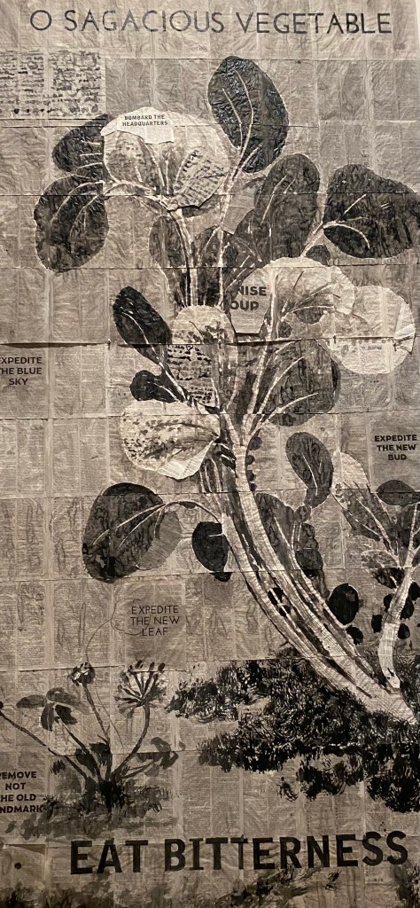
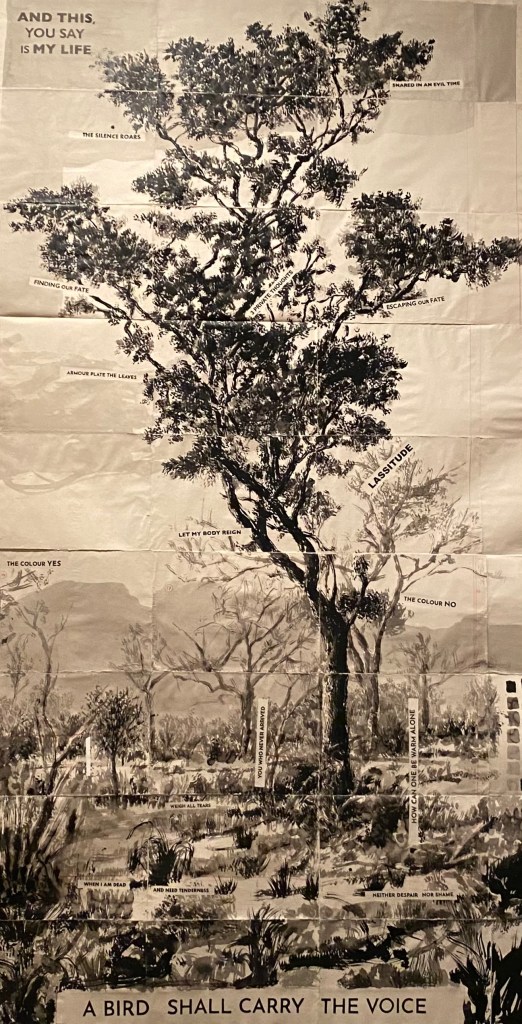
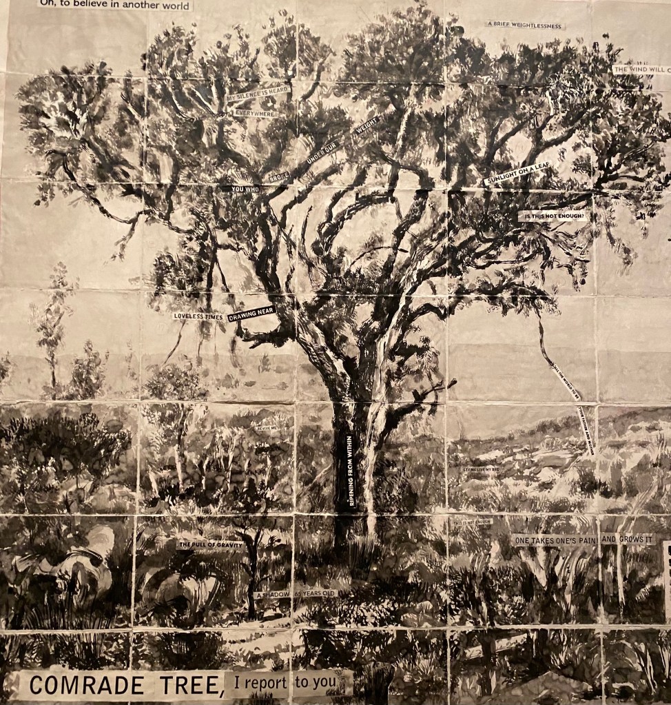
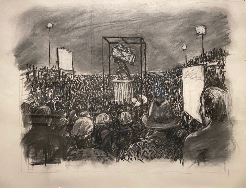
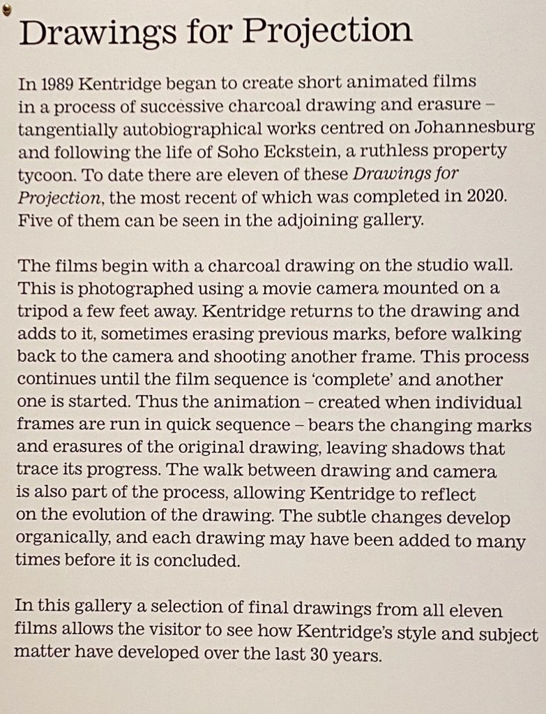
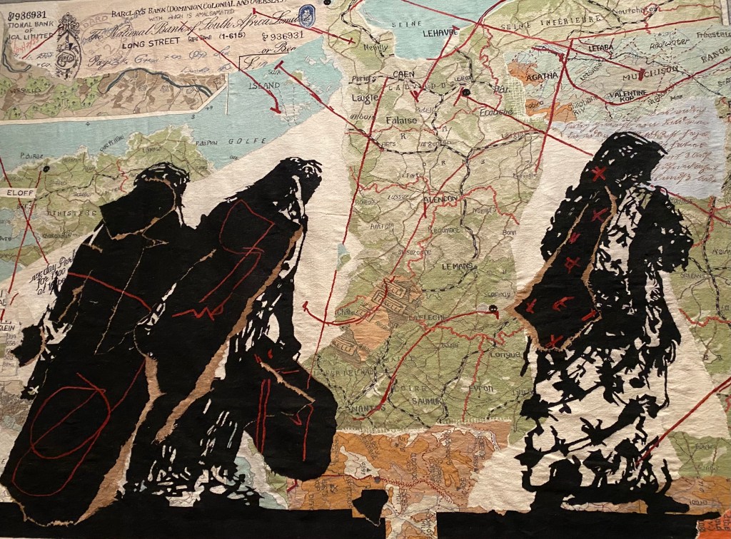
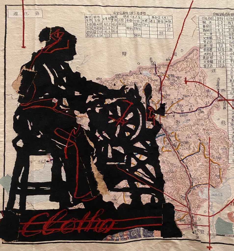
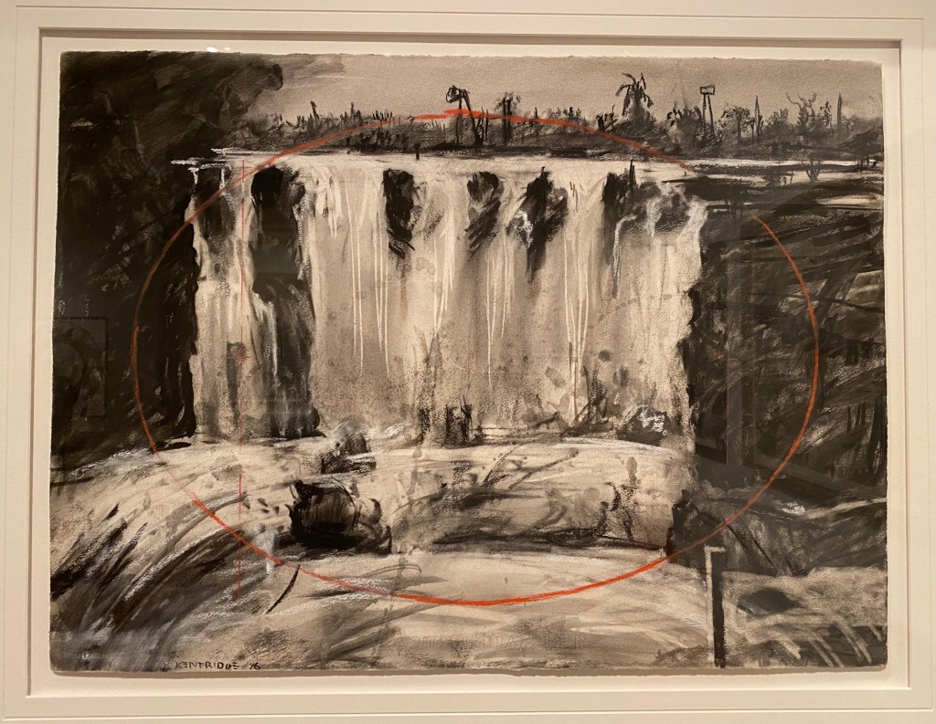
I found this exhibition quite overwhelming, in a good sense. I thought it was remarkable. Many of the drawings are in charcoal and this reminded me that at the start of my BA I made a decision to draw only in black and white with tiny additions of colour (which is what Kentridge does). I remember reading that black and white is very powerful because the distraction of colour is removed, and certainly my initial reaction on walking into the first room of the exhibition was ‘wow’. The drawings are also enormous – measurements were not given but I’d say an average drawing was about 4 x 6 feet – some much bigger and the flower/tree drawings at the end of the exhibition were probably about 12 x 12 feet. These larger drawings are often made up of smaller paper panels, sometimes dictionary pages are used and there must be dozens of them in one large drawing. Kentridge is an artist who works in many different mediums – I read that he first came to attention for his animated drawings. I read that Kentridge originally made these by working on, removing and reworking marks on the same drawings, rather than making a series of drawings. He recently made an. opera called Sibylle, and I see he has directed other theatre and opera productions, as well as made films. He originally trained in mime and theatre at Le Coq in Paris, and this love of theatre is clear in his work. A favourite was the ‘black box’, a puppet theatre with moving images and light animation. I have no idea what it was about but it was beautiful. The huge tapestries were also stunning.
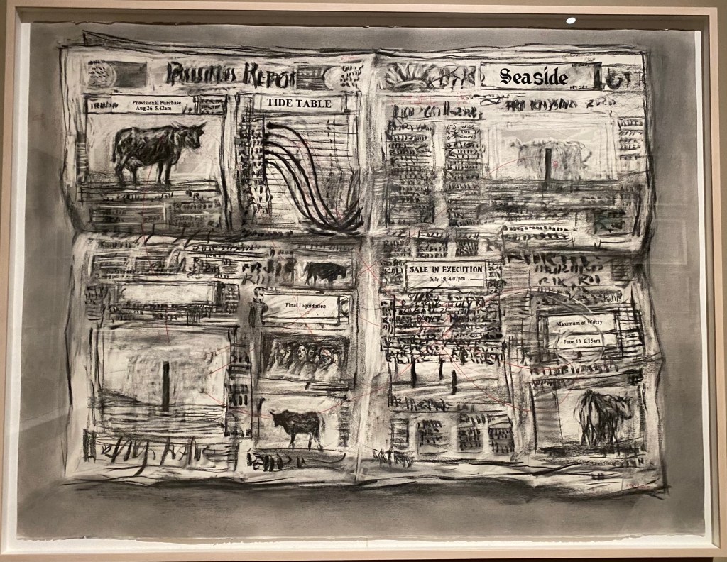
There is a lot for me to learn from Kentridge apart from his use of charcoal with small touches of pastel. He also uses text a lot, which I plan on doing, but he uses it in a subtle and unclear way rather than to give a direct message. He also works on found paper quite a lot, including dictionary pages, but I could see no evidence that this is chosen to give a specific message. The scale of his work is really important – as I mention, much of it is enormous. I tend to work small and on the MA perhaps I should use the fact that I have my own fairly large studio to work much bigger – even if in panels that I then fit together. I think that Kentridge starts the charcoal drawings on white paper, rather than tinted, but I couldn’t work out what kind of paper he tends to use. As mentioned above, I also really like his animations made from charcoal drawings – I’d really like to do this. I also see from the exhibition notes that Kentridge began with single drawings and later drew diptchs or triptychs – again something I have done and would like to develop: I like the narrative effect of this. I should also think about the use of symbols – see the notes below.
I would say that Kentridge answers the research questions I have set myself for my work: he synthesises subject with process, and he synthesises social critique with emotional warmth, and sometimes humour (I didn’t mention humour in my proposal, but humour is really important). .


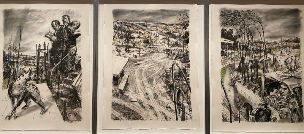


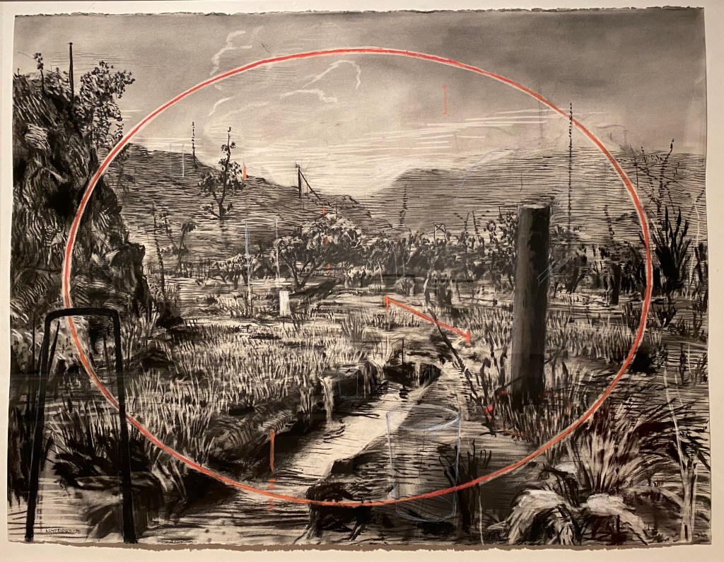
I like this a lot. The title is really important. Of course all land is colonised, and this makes me think of copying the idea from Kentridge and calling , say, any forest or field in the UK a colonial landscape – it is colonised in the sense that it is taken by humans for their use and we develop beliefs that teach us that this is perfectly acceptable, just as the coloniser’s of Africa did. It might be objected that the land in Africa was stolen from the Africans, but this is a human centred view, and work on Ecocide has to question this anthropocentrism.